Implementing On Your Website
The 3D Product Configurator front end code can be implemented on customer facing websites through several methods. Defined below are options an implementing developer can use to integrate with a website.
Front End Application Supported Browsers and Devices
Chrome | 51+ |
Firefox | 54+ |
Edge | 14+ |
Safari | 10+ (except 15.0; 15.1+ supported) |
Opera | 38+ |
Internet Explorer | Not supported |
Edge iOS | Not supported |
Front End Application URL Parameters
● ?config=<configId>
○ The Id of the configurator to load, used for debugging purposes a developer should pass in the configurator id in the initialization functions of the API for production use.
● ?storeId=<storeId>
○ Store Id used for Analytics
● ?sku=<sku>
○ Sku of the current chair loaded, auto updated on swapping steps
● ?preview=<true/false>
○ This parameter is for testing purposes only and will force the application to always load the latest version of the configurator.
Adding the library from the 3D Cloud CDN
Ask your account team for your specific CDN URLs.
JS example:
https://cdn.3dcloud.io/{client_specific_folder}/x.x.x/MxtProductConfigurator-x.x.x.js
Minified JS example (should be used in production environments)
https://cdn.3dcloud.io/{client_specific_folder}/x.x.x/MxtProductConfigurator-x.x.x.min.js
CSS example:
https://cdn.3dcloud.io/{client_specific_folder}/x.x.x/MxtProductConfigurator-x.x.x.css
Initiating the application example:
<!DOCTYPE html>
<html>
<head>
    <title>MxtModularConfigurator Example</title>
    <link href="https://cdn.3dcloud.io/mxt-kongfigurator/10.2.0/MxtProductConfigurator-10.2.0.css" rel="stylesheet">
    <style>
        .mxt-full-modal-screen {
            width: 80%;
            height: 100%;
            position: absolute;
        }
    </style>
</head>
<body>
    <div id="spins-test-container" class="mxt-full-modal-screen"></div>
    <script src="https://cdn.3dcloud.io/mxt-kongfigurator/10.2.0/MxtProductConfigurator-10.2.0.min.js"></script>
    <script>
        async function initializeUnitConfig() {
            const unitConfig = new MxtProductConfigurator.MxtKongfigurator({
                spinCommon: {
                    apiKey: '{user api key provided by 3D Cloud}',
                    element: document.getElementById('spins-test-container'),
                    expandButton: {},
                    webArMode: "OnDemand"
                },
                spin3d:{
                    camera: {},
                    screenshot: {},
                },
                assetEnvironment: '{Active OR Stage}',
                configurationId:  '{configurator ID to load}',
                configurationBrowserId: '{configurator ID to browse from}',
            });
            await unitConfig.init();
        }
        initializeUnitConfig();  // Call the function
    </script>
</body>
</html>
Initialization
When initializing, there are two things that MUST be true about the HTML element that you pass in (or the parent element for the viewer container, see the Components section below)
It MUST have a defined height and width, whether that is an absolute value (like 600px) or a percentage of its parent that has an absolute value (for example 50% of the page width/height). This is because the 3d canvas has no defined size in and of itself, so we have no “size to build out”, so to speak. Additionally, if a size is NOT given, the 3d render engine will spin out of control attempting to render in a 0x0 space.
(for 3d render type only) It MUST be not be
display:nonewhile the engine is running. By default, the engine starts running oninit. IF you want to init the MxtKongfigurator in a hidden container, use the optionspin3d.loadPaused. The 3d renderer will spin out of control when attempting to render to a non-visible container. By using the optionspin3d.loadPaused, the renderer will start in a paused mode. In order to start the rendering engine when the container is made visible, call therun()method. To re-pause the renderer, call thestop()method.
Minimum Required Options
When constructing the class for the product configurator there are required options and optional options that you will set for the product configurator to function properly. These are the three required options that you must always set.
Option Name | Option Description |
spinCommon.apiKey | API Key provided by 3D Cloud™(required) |
configurationId | the unique id of the configurator to load (required) |
spinCommon.element | The element that the Configurator will be built within. Some sort of specific height and width must be given, otherwise the app will not have any size. This is due to the fact that the rendering canvas has no inherent size. (required) |
configuratorBrowserId | The unique id of the configurator browser step to load on startup inside the configurator when using a step type configurator browser and you want to override the default choice in the configurator data. |
Basic Optional Options
These options are optional and are the most commonly set by developers implementing the product configurator on their website.
SpinCommon options
These options are applicable to the render view for both 2d and 3d renders, and live under spinCommon, i.e.
const configurator = new MxtProductConfigurator.MxtKongfigurator({
    spinCommon: {
        apiKey: '{user api key provided by 3D Cloud}',
        ...
    },
});
apiKey and element are covered above.
Option Name | Option Description |
| CSS string defining color of loading progress bar. |
| CSS string defining color of loading progress bar background. |
| The environment of services to hit. Defaults to production. |
logging | Sets the log level which can be pulled from log.levels namespace; Defaults to WARN |
AR Options
Part spinCommon options.
webArMode?: WebArMode;
webArOptions?: MxtSpinsWebArOptions;
WebArMode defaults to WebArMode.None.
WebArMode.Pregeneratedwill attempt to get an AR asset that has already been generated and stored based on the current sku(s). If none exists, then no web AR asset will be available.WebArMode.OnDemandwill look up an existing AR asset based on sku(s), but if one does not exist, a new one will be generated when a user requests one.
webArOptions.enableScaling - by default, scaling on USDZ is turned off. If you wish to enable, set this flag
Customizing Text and Icons Options
This only applies to spinCommon options:
To customize icons used in the renderer view:
icons: {
    about?: string;
    close?: string;
    collapse?: string;
    presetView?: string;
    presetViewActive?: string;
    download?: string;
    downloadInverse?: string;
    downloadActive?: string;
    expand?: string;
    rotateLeft?: string;
    rotateRight?: string;
    spinner?: string;
    webAr?: string;
    webArInverse?: string;
    zoomIn?: string;
    zoomOut?: string;
}
To customize text:
customText in the format {[language: string]: any;} where language is a language ISO code (https://www.metamodpro.com/browser-language-codes), for example:
customText : {
    en: {
      about: {
          appName: "My example app name"
      }
    }
};
Rather than providing an exhaustive list of every available key, please contact us with the text you desire to override, and we will provide you with the appropriate key(s).
spin3d Options
These options are applicable to the render view for 3d renders only, and live under spin3d, i.e.
const configurator = new MxtProductConfigurator.MxtKongfigurator({
    spin3d: {
        camera: {}
        ...
    },
});
Option Name | Option Description |
| Use this if you dont want the 3d render loop to start immediately upon initialization. Use especially if you are initializing in a hidden div or one with no size. Call run() method to start the 3d render loop whenever the div becomes visible. |
|
|
|
|
| The amount of screen that a product should “fill” when initially loaded; essentially default zoom level but relative to product size |
| Effectively max zoom, relative to the default zoom level |
|
|
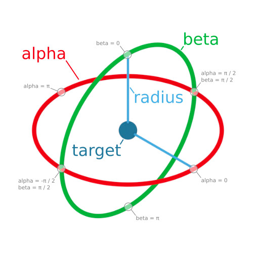
Camera Options
Part spin3d options. All nested within a “camera” options object, i.e.
spin3d: {
    camera: {
      allowPanning: true,
      ...
    }
},
Option Name | Option Description |
| If true, right click pans the camera rather than rotates the camera. Panning is limited to bounds of product. |
| |
|
|
|
|
| Minimum camera angle that the camera can rotate horizontally |
| Maximum camera angle that the camera can rotate horizontally |
Hotspot Options
Part spin3d options. All nested within a “hotspots” options object, i.e.
spin3d: {
    hotspots: {
      invisibleOnLoad: true,
      ...
    }
},
Option Name | Option Description |
| There is a hotspot toggle in the UI. By default, hotspots show up when there are hotspots and the UI toggle is on. This defaults the UI toggle to off so that the user has to manually toggle the hotspots on. |
| URL base path for a hotspot mesh; we provide a default hotspot mesh, but a custom one can be provided by using this + |
| Filename of hotspot mesh. Must be a GLB/GLTF file. URL is created by doing |
Customizing 3D viewer Icon Options
This only applies to spin3d options:
To customize icons used in the 3drenderer view:
icons: {
    hotspotToggle?: string;
    hotspotToggleActive?: string;
    hotspotToggleInverse?: string;
    dimensions?: string;
    dimensionsActive?: string;
    dimensionsInverse?: string;
    panningGuidanceMouse?: string;
    panningGuidanceMousePan?: string;
    panningGuidanceDrag?: string;
    panningGuidanceTwoFingerDrag?: string;
}
Dimension Options
Part spin3d options. All nested within a “dimensions” options object, i.e.
spin3d: {
    dimensions: {
      enabled: true
      ...
    }
},
Option Name | Option Description |
| Enable/disable dimensions. Enabled by default |
| Color of dimension lines: |
| Unit type to display for dimensions; defaults to inches. |
| If dimensions should be visible on load. Defaults to off, users must toggle it on |
| Size of line |
| Size of arrows at the end of the line |
Preset Views Options
Part spin3d options. All nested within a “presetViews” options object, i.e.
spin3d: {
    presetViews: {
      enabled: true
      ...
    }
},
Option Name | Option Description |
| Enable/disable preset views. Enabled by default |
| We supply default preset views. To override these, provide an array of objects in format: |
Screenshot Options
Part spin3d options. All nested within a “screenshot” options object, i.e.
spin3d: {
    screenshot: {
      width: 1024
      ...
    }
},
Option Name | Option Description |
| By default, enabled. |
|
|
|
|
|
|
|
|
| Provide a watermark for your screenshot downloads |
| By default, we provide certain downloads (jpg and png). If you want to provide more/different types, use these plugins to add more. |
| By default, the downloaded image gets a filename of the sku; override this to provide a custom imageFilename |
spin2d options
These options are applicable to the render view for 2d renders only, and live under spin2d, i.e.
const configurator = new MxtProductConfigurator.MxtKongfigurator({
    spin2d: {
        zoomDisabled: true
        ...
    },
});
Option Name | Option Description |
| Use this to disable zoom controls and not allow the user to look at a zoomed in (higher resolution) render |
|
|
Configurator Level Options
These options are applicable to the configurator in general and live at the root level of options
const configurator = new MxtProductConfigurator.MxtKongfigurator({
    assetEnvironment: MxtKongfigAssetEnvironment.STAGING
    ...
});
Option Name | Option Description |
| 2d or 3d or none. Defaults to 3d. |
| Use PRODUCTION for your production environment and STAGING for your cert environment, and TEST for your test enviroment. LATEST includes works-in-progress configurators and shouldn’t be used generally by clients. |
|
|
| If you want to load a particular sku that is different than the default sku that a configurator model would naturally load |
| Sets the primary color, secondary color, and drop shadow (used on certain buttons). Secondary color is used for the pricing, as well as the gradient color on the main CTA Many more color options can be set via css variables; see custom CSS section. |
| Background color of the renderer only (not of the UI). Use any valid css string |
| Background color to use for screenshots; may be different than the normal background color |
| Ordinarily, for sharing, we share a link that points back to the current HTTP address of the page; override this to point to a custom page. Current URL search params are added to this url. |
heading | Override the default camera heading in degrees, for 3d render type only |
| Override the default camera pitch in degrees, for 3d render type only |
zoom | Override the default zoom, for 3d render type only |
| By default, our UI does not show the step number next to steps; make this true to show step number |
| |
maxFrameRate | |
renderQualityLevel | |
Advanced Options, Plugins, and Callbacks
Plugins
There are number of different plugins available to override or add to Configurator.
Analytics: spinCommon.analyticsPlugin - Provide a custom analytics plugin; you would probably want to extends Kong3dSpinsAnalyticsPlugin or Kong2dSpinsAnalyticsPlugin depending on if it is a 2d or 3d render type.
All other plugins are passed in via spinCommon.plugins.
Plugins that are NOT provided by default:
KongPluginTypes.BOM- add a plugin that implementsIConfiguratorBomPluginand handles creating a bill of materialsKongPluginTypes.ATC- add a plugin that implementsIConfiguratorAddToCartPluginand handles adding to cartKongPluginTypes.CRM- add a plugin that implementsIConfiguratorCRMPluginand handles doing CRMPLUGIN_TYPE.CONFIG_PRICING- add a plugin that implementsIConfiguratorPricingPluginand handles doing CRM
Plugins that provide a default, but you may want to override:
RendererPluginType.SIF- add a plugin that extendsSIFPluginand provides custom behavior/SIF resolutionKongPluginTypes.HELP_ME_DECIDE- add a plugin that extendsKongHelpMeDecidePluginand provides custom UI for the help me decide modalKongPluginTypes.OPTION_PAGE- add a plugin that extendsOptionPagePluginand provides custom UI for the options UIKongPluginTypes.STEP_PAGE- add a plugin that extendsStepPagePluginand provides custom UI for the steps UIKongPluginTypes.OPTION_POPOVER- add a plugin that extendsOptionPopoverPluginand provides custom UI for the tooltip on options
When creating a plugin, there is an id field that must be provided on the plugin (it is provided on all of our default plugins). If you want the same plugin to be used for every single configurator, use id = DEFAULT_PLUGIN_ID. If you want to use a different plugin for different configurators, then provide plugins with custom id fields, that match the plugin id field on the configurator model.
Changing Currently Loaded SKU programmatically
You can set the current SKU in the current configurator to load/show via this public function on the MxtKongfigurator class.
async setSkus(skus: string[], keepCameraAngle = false): Promise<void>
MxtKongfigurator.setSkus(...)
Functions for External Control of the Configurator
The IConfiguratorDataAPI interface exposes a simplified, read-only view of the configurator's current state. It is implemented by MxtKongfigurator and designed for programmatic (including AI) clients to query configurator data without needing to understand the full internal architecture.
Initializing MxtKongfigurator
Before you can use IConfiguratorDataAPI, you need to create and initialize an MxtKongfigurator instance.
Required Options
Property | Type | Description |
|---|---|---|
|
| Your MXT API key |
|
| The DOM element to render into (required if |
|
| One of: |
Basic Initialization
import { MxtKongfigurator } from './kongfigurator/MxtKongfigurator';
import { MxtKongfigAssetEnvironment } from '@mxt/mxt-js-renderer-core/lib/configurable/model/MxtKongfigAssetEnvironment';
const parentElement = document.getElementById('configurator-container') as HTMLDivElement;
const configurator = new MxtKongfigurator({ spinCommon: { apiKey: 'YOUR_API_KEY', element: parentElement, }, assetEnvironment: MxtKongfigAssetEnvironment.PRODUCTION, initialSkus: ['SKU1', 'SKU2'], // optional: load specific SKUs on start configurationId: 'your-config-id', // optional: load a specific configuration });
await configurator.init();
Initialization with iframe Communication
When the configurator is hosted inside an iframe and you need the parent window to communicate with it via postMessage, pass an iframeCommunicator:
import { MxtKongfiguratorIFrameCommunicator } from './kongfigurator/ui/MxtKongfiguratorIFrameCommunicator';
const isInIframe = window.self !== window.top;
const configurator = new MxtKongfigurator({
spinCommon: {
apiKey: 'YOUR_API_KEY',
element: parentElement,
},
assetEnvironment: MxtKongfigAssetEnvironment.PRODUCTION, iframeCommunicator: isInIframe ? new MxtKongfiguratorIFrameCommunicator(targetOrigin) : undefined,
});
await configurator.init();
The targetOrigin should be the origin of the parent window (e.g., 'https://your-site.com'). When running in iframe context, this is typically read from a URL query parameter (targetOrigin), falling back to window.origin.
Lifecycle
// Create and initialize const configurator = new MxtKongfigurator(options);
await configurator.init();
// Use the Data API
const state = configurator.getConfiguratorState();
// Clean up when done
configurator.destroy();
Interface Definition
export interface IConfiguratorDataAPI {
getConfiguratorInfo(): MxtConfiguratorController;
getConfiguratorState(): {
[stepId: string]: {
selectedOptionId: string;
visible: boolean
}
};
getStepInfo(stepId: string): MxtConfiguratorStep;
getOptionInfo(stepId: string, optionId: string): MxtConfiguratorOption;
getAvailableSteps(): MxtConfiguratorStep[];
getAvailableOptions(stepId: string): MxtConfiguratorOption[];
}
MxtKongfigurator implements this interface directly, so all methods are available on any MxtKongfigurator instance after init() completes.
API Methods
getConfiguratorInfo
getConfiguratorInfo(): MxtConfiguratorController
Returns the full MxtConfiguratorController, which is the central controller managing all configurator state. Use this when you need access to the complete configurator model, current product, SKU information, or need to call controller methods like selectOption() or loadSKU().
Example:
const controller = configurator.getConfiguratorInfo();
// Access the current product
const product = controller.currentProduct;
// Access current SKUs
const skus = controller.currentSkus; // string[]
const sku = controller.currentSku; // combined string
// Access the full model
const allSteps = controller.model.steps;
getConfiguratorState
getConfiguratorState(): { [stepId: string]: { selectedOptionId: string; visible: boolean } }
Returns a serialized snapshot of the current configurator state as a map of step IDs to their current selection and visibility. This iterates over all steps (not just visible ones).
selectedOptionIdcan beundefinedif the step is hidden or has no way to set a default due to current rules.visibleindicates whether the step is currently visible based on configurator rules.
Example:
const state = configurator.getConfiguratorState();
for (const [stepId, { selectedOptionId, visible }] of Object.entries(state)) {
console.log(`Step ${stepId}: selected=${selectedOptionId}, visible=${visible}`);
}
// Example output:
// Step color: selected=opt_red, visible=true
// Step size: selected=opt_large, visible=true
// Step accessory: selected=undefined, visible=false
getStepInfo
getStepInfo(stepId: string): MxtConfiguratorStep
Returns the full MxtConfiguratorStep object for a given step ID. Uses the model's internal stepMap for O(1) lookup.
Example:
const step = configurator.getStepInfo('color');
console.log(step.name); // "Color"
console.log(step.label); // Display label
console.log(step.options.length); // Number of options in this step
console.log(step.isVisible); // Base visibility flag
getOptionInfo
getOptionInfo(stepId: string, optionId: string): MxtConfiguratorOption
Returns the full MxtConfiguratorOption object for a specific option within a step. Internally calls getStepInfo(stepId) then looks up the option from the step's optionMap.
Example:
const option = configurator.getOptionInfo('color', 'opt_red');
console.log(option.name); // "Red"
console.log(option.label); // Display label
console.log(option.skuComponentCode); // SKU component code for this option
console.log(option.price); // Price value
console.log(option.image); // Thumbnail image URL
getAvailableSteps
getAvailableSteps(): MxtConfiguratorStep[]
Returns only the steps that are currently visible based on the configurator's rule engine. This delegates to the controller's getVisibleSteps() method.
Example:
const visibleSteps = configurator.getAvailableSteps();
for (const step of visibleSteps) {
console.log(`${step.id}: ${step.name}`);
}
getAvailableOptions
getAvailableOptions(stepId: string): MxtConfiguratorOption[]
Returns only the options that are currently visible for a given step, based on the configurator's rule engine. This delegates to the controller's getVisibleOptions() method.
Example:
const visibleOptions = configurator.getAvailableOptions('color');
for (const option of visibleOptions) {
console.log(`${option.id}: ${option.label} ($${option.price})`);
}
Using the Data API via iframe Messages
When the configurator runs inside an iframe, the parent window can access the Data API through postMessage. The MxtKongfiguratorIFrameCommunicator listens for incoming messages and responds with the corresponding data.
Message Protocol
Send a request from the parent window:
const iframe = document.getElementById('configurator-iframe');
iframe.contentWindow.postMessage(
{
type: 'MESSAGE_TYPE',
data: { /* optional parameters */ },
},
targetOrigin
);
Listen for the response in the parent window:
window.addEventListener('message', (event) => {
if (event.data.type === 'RESPONSE_TYPE') {
const result = event.data.data; // handle the result
}
});
Data API Message Types
Request type | Request data | Response type | Response data |
|---|---|---|---|
'getConfiguratorInfo' | (none) | 'getConfiguratorInfo' | MxtConfiguratorController |
'getConfiguratorState' | (none) | 'getConfiguratorState' | { [stepId]: { selectedOptionId, visible } } |
'getStepInfo' | { stepId: string } | 'getStepInfo' | MxtConfiguratorStep |
'getOptionInfo' | { stepId: string, optionId: string } | 'getOptionInfo' | MxtConfiguratorOption |
'getAvailableSteps' | (none) | 'getAvailableOptions' | MxtConfiguratorStep[] |
'getAvailableOptions' | { stepId: string } | 'getAvailableOptions' | MxtConfiguratorOption[] |
Additional iframe Message Types
Beyond the Data API, the iframe communicator supports these operational messages:
Request | Description | Response |
|---|---|---|
| Take a screenshot (optional: |
|
| Get displayed/sorted steps |
|
| Get render generation data (product, camera, sku, backgroundColor) |
|
| Start bulk SKU rendering |
|
| Validate a SKU array ( |
|
| Check bulk render support |
|
| Merge partial | (none) |
// Parent window code
const iframe = document.getElementById('configurator-iframe');
const KONGFIG_ORIGIN = 'https://kongfigurator.example.com';
// Request the current configurator state iframe.contentWindow.postMessage({ type: 'getConfiguratorState' }, KONGFIG_ORIGIN);
// Request info about a specific step
iframe.contentWindow.postMessage( { type: 'getStepInfo', stepId: 'color', }, KONGFIG_ORIGIN );
// Request available options for a step iframe.contentWindow.postMessage( { type: 'getAvailableOptions', stepId: 'color', }, KONGFIG_ORIGIN );
// Listen for responses
window.addEventListener('message', (event) => {
if (event.origin !== KONGFIG_ORIGIN) return;
switch (event.data.type) {
case 'getConfiguratorState':
console.log('State:', event.data.data);
break;
case 'getStepInfo':
console.log('Step:', event.data.data);
break;
case 'getAvailableOptions':
console.log('Options:', event.data.data);
break;
}
});
Configurator Notifications
The MXT platform uses a global pub/sub system called NotificationCenter to broadcast configurator lifecycle events. The ConfiguratorMessageType enum defines typed notification names that fire when configurator state changes (option selected, step visibility changed, SKU calculated, etc.).
NotificationCenter API
NotificationCenter is a singleton imported directly from @mxt/mxt-services. It is not accessed via .Instance() -- you import and use it directly.
import { NotificationCenter } from '@mxt/mxt-services/lib/notifications/NotificationCenter';
Methods
Method | Signature | Description |
|---|---|---|
|
| Subscribe a callback to a notification. Set |
|
| Unsubscribe a callback. Must pass the same function reference used in |
|
| Post a notification to all subscribers. Data should be an object, not a primitive. |
|
| Returns a Promise that resolves the next time the notification fires (subscribes with |
|
| Removes all subscribers for all notifications. Called internally by |
Basic Usage
import { NotificationCenter } from '@mxt/mxt-services/lib/notifications/NotificationCenter';
import { ConfiguratorMessageType } from '@mxt/mxt-js-renderer-core/lib/configurable/interfaces/ConfiguratorNotifications';
// Subscribe to option selection changes
const onOptionSelected = (data) => {
console.log(`Step ${data.stepId}: ${data.prevOptionId} -> ${data.nextOptionId}`);
};
NotificationCenter.subscribe(ConfiguratorMessageType.AFTER_SELECT_OPTION, onOptionSelected); // Clean up when done
NotificationCenter.unsubscribe(ConfiguratorMessageType.AFTER_SELECT_OPTION, onOptionSelected);
Using once for One-Time Listeners
// Listen for the next SKU calculation only
NotificationCenter.subscribe(
ConfiguratorMessageType.AFTER_CALCULATE_SKU,
(data) => {
console.log(`New SKU: ${data.nextSku}`);
},
true // auto-unsubscribes after first call
);
// Or use the Promise-based version
const data = await NotificationCenter.waitForOneNotification(
ConfiguratorMessageType.AFTER_CALCULATE_SKU
);
console.log(`New SKU: ${data.nextSku}`);
Using with Class Methods
When subscribing with a class method, use .bind(this) and keep the bound reference for unsubscribing:
class MyComponent {
constructor() {
this.onOptionSelected = this.onOptionSelected.bind(this);
NotificationCenter.subscribe( ConfiguratorMessageType.AFTER_SELECT_OPTION, this.onOptionSelected );
}
onOptionSelected(data) {
console.log(`Selected: ${data.nextOptionId}`);
}
destroy() {
NotificationCenter.unsubscribe( ConfiguratorMessageType.AFTER_SELECT_OPTION, this.onOptionSelected );
}
}
ConfiguratorMessageType
All configurator lifecycle notifications follow a BEFORE_* / AFTER_* pattern. BEFORE_* fires before the state change is applied; AFTER_* fires after.
import { ConfiguratorMessageType } from '@mxt/mxt-js-renderer-core/lib/configurable/interfaces/ConfiguratorNotifications';
Enum Value | String | Description |
|---|---|---|
|
| Before an option is selected |
|
| After an option is selected |
|
| Before a selected option is set on the controller |
|
| After a selected option is set on the controller |
|
| Before step visibility changes |
|
| After step visibility changes |
|
| Before step sort order changes |
|
| After step sort order changes |
|
| Before an option override (e.g. price) is applied |
|
| After an option override is applied |
|
| Before option visibility changes |
|
| After option visibility changes |
|
| Before option sort order changes |
|
| After option sort order changes |
|
| Before the selected mesh changes |
|
| After the selected mesh changes |
|
| Before the selected material changes |
|
| After the selected material changes |
|
| Before materials list changes |
|
| After materials list changes |
|
| Before SKU recalculation |
|
| After SKU recalculation |
|
| Before a product assembly loads |
|
| After a product assembly loads |
|
| Before the configurator is destroyed |
|
| After the configurator is destroyed |
|
| Before default assembly IDs are saved |
|
| After default assembly IDs are saved |
Notification Payloads
Each notification type carries a specific payload. The full type mapping is available via ConfiguratorNotificationPayloadMap.
Option Selection
Used by: BEFORE_SELECT_OPTION, AFTER_SELECT_OPTION, BEFORE_SET_SELECTED_OPTION, AFTER_SET_SELECTED_OPTION
interface ConfiguratorSelectOptionPayload {
stepId: string; prevOptionId: string; nextOptionId: string;
}
Step Visibility
Used by: BEFORE_SET_STEP_VISIBLE, AFTER_SET_STEP_VISIBLE
interface ConfiguratorStepVisiblePayload {
stepId: string; prevVisible: boolean | null; nextVisible: boolean;
}
Step Order
Used by: BEFORE_SET_STEP_ORDER, AFTER_SET_STEP_ORDER
interface ConfiguratorStepOrderPayload {
stepId: string; prevOrder: number | null; nextOrder: number;
}
Option Override
Used by: BEFORE_SET_OPTION_OVERRIDE, AFTER_SET_OPTION_OVERRIDE
interface ConfiguratorOptionOverridePayload {
stepId: string;
optionId: string;
prevOverride: MxtConfiguratorOverride | null;
nextOverride: MxtConfiguratorOverride;
}
// MxtConfiguratorOverride = { price?: number }
Option Visibility
Used by: BEFORE_SET_OPTION_VISIBLE, AFTER_SET_OPTION_VISIBLE
interface ConfiguratorOptionVisiblePayload {
stepId: string;
optionId: string;
prevVisible: MxtConfiguratorOptionVisibility | null; nextVisible: MxtConfiguratorOptionVisibility;
}
// MxtConfiguratorOptionVisibility: DO_NOT_SHOW = 0, VISIBLE = 1, UNAVAILABLE = 2
Option Order
Used by: BEFORE_SET_OPTION_ORDER, AFTER_SET_OPTION_ORDER
interface ConfiguratorOptionOrderPayload {
stepId: string;
optionId: string;
prevOrder: number | null;
nextOrder: number;
}
Mesh Selection
Used by: BEFORE_SET_SELECTED_MESH, AFTER_SET_SELECTED_MESH
interface ConfiguratorSelectedMeshPayload {
componentName: string;
prevMeshId: string | null;
nextMeshId: string | null;
}
Material Selection
Used by: BEFORE_SET_SELECTED_MATERIAL, AFTER_SET_SELECTED_MATERIAL
interface ConfiguratorSelectedMaterialPayload {
componentName: string;
prevMaterial: string | null;
nextMaterial: string;
}
Materials List
Used by: BEFORE_SET_MATERIALS, AFTER_SET_MATERIALS
interface ConfiguratorMaterialsPayload {
componentName: string;
prevMaterials: string[] | null;
nextMaterials: string[];
}
SKU Calculation
// BEFORE_CALCULATE_SKU interface ConfiguratorBeforeCalculateSkuPayload { prevSku: string | null; prevSkus: string[] | null; } // AFTER_CALCULATE_SKU interface ConfiguratorAfterCalculateSkuPayload { prevSku: string | null; prevSkus: string[] | null; nextSku: string; nextSkus: string[]; }
Product Assembly
// BEFORE_LOAD_PRODUCT_ASSEMBLY interface ConfiguratorBeforeLoadProductAssemblyPayload {
prevProductId: string | null;
}
// AFTER_LOAD_PRODUCT_ASSEMBLY interface
ConfiguratorAfterLoadProductAssemblyPayload {
prevProductId: string | null;
nextProductId: string | null;
}
Destroy
Used by: BEFORE_DESTROY, AFTER_DESTROY
interface ConfiguratorDestroyPayload {
prevProductId: string | null;
}
Save Default Assembly IDs
// BEFORE_SAVE_DEFAULT_PRODUCT_ASSEMBLY_IDS
interface ConfiguratorBeforeSaveDefaultAssemblyIdsPayload {
productId: string;
prevStepIds: string[] | null;
}
// AFTER_SAVE_DEFAULT_PRODUCT_ASSEMBLY_IDS
interface ConfiguratorAfterSaveDefaultAssemblyIdsPayload {
productId: string;
prevStepIds: string[] | null;
nextStepIds: string[];
}
Application-Level Notifications
In addition to the typed ConfiguratorMessageType notifications, the application posts several string-based notifications:
Notification Name | Payload | Description |
|---|---|---|
|
| Fired after a configuration file is loaded |
|
| Fired when a configurator section expands |
|
| Fired when a hotspot link is clicked |
Example -- listening for config load:
const onConfigLoaded = (configFile) => {
console.log('Configuration loaded:', configFile.id);
};
NotificationCenter.subscribe('MxtKongfigurator_Config_Loaded', onConfigLoaded);
// Clean up
NotificationCenter.unsubscribe('MxtKongfigurator_Config_Loaded', onConfigLoaded);
Key Types Reference
MxtConfiguratorStep
Property | Type | Description |
|---|---|---|
|
| Unique step identifier |
|
| Step name |
|
| Display label |
|
| Base visibility flag |
|
| How the step is displayed in the UI |
|
| Step thumbnail image URL |
|
| Camera settings for this step |
|
| All options in this step |
|
| O(1) lookup map for options by ID |
|
| Order of this step's component in the SKU |
|
| Filters applicable to this step |
|
| Help content for this step |
|
| Custom properties |
|
| Property lookup map |
|
| Hotspot definitions |
MxtConfiguratorOption
Property | Type | Description |
|---|---|---|
|
| Unique option identifier |
|
| Option name |
|
| Display label |
|
| SKU component code for this option |
|
| Price value |
|
| Thumbnail image URL |
|
| Render components |
|
| Filter data |
|
| Tooltip header text |
|
| Tooltip body text |
|
| Help image URL |
|
| Help label |
|
| Custom properties |
|
| Property lookup map |
MxtConfiguratorController (key members)
callbacks?: {
    /** Allow for overriding of the error handling. Return false to prevent our default error handling, return true to continue our normal error handling */
    onError?: (e: PromiseRejectionEvent) => boolean;
};
By default, we handle errors by presenting an error modal to the user. If you want custom behavior, then override this method. To prevent our default modal, make sure you return false from the callback.
Custom Expand/Collapse
spinCommon: {
    expandButton?: {
        onExpand?: () => void;
        onCollapse?: () => void;
    };
},
The picker (if present) will automatically be hidden onExpand and restored onCollapse. However, if you want to take additional action on expand/collapse, hook into these callbacks
Components
Default Layout
By default, the configurator builds out all of the UI in the format below underneath the HTML element provided in the options:
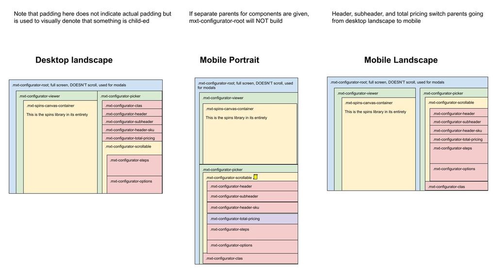
However, we provide the ability for each UI components to be parented independently to best provide the needs for your custom UI. The list of components are:
Component Type | Component Typescript Class | Component CSS Class | Notes |
|---|---|---|---|
|
|
| Contains the UI for picking steps/options, as well as the header/sku/pricing/etc (by default). Basically everything that isn’t the renderer |
|
|
| The container for the renderer. Contains both the renderer itself and the button bar for the renderer. |
|
|
| The scrollable section of the picker; see diagram above, depending on device contains different things. |
|
|
| Container for all modals; by default overlays both the picker container and viewer container |
|
|
| Contains the actual renderer. |
|
|
| Buttons for manipulating renderer (zoom/rotate/etc) |
|
|
| Button to trigger WebAR |
|
|
| Button to trigger About modal |
|
|
| Download screenshot button on button bar |
|
|
| Toggle dimensions button on button bar |
|
|
| Toggle hotspots button on button bar |
|
|
| Show preset view modal button on button bar |
|
|
| Expand/collapse renderer view |
|
|
| Container to show steps; uses |
|
|
| Container to show options; uses |
|
|
| Header label (name of configurator) |
|
|
| Subheader label |
|
|
| Sku label |
|
|
| Pricing label |
|
|
| CTA container |
|
|
| Share button, only shows if enabled for configurator model |
|
|
| Add to cart button, only shows if there is an Add to cart plugin |
|
|
| SIF button, only shows if sif is enabled in app config |
|
|
| CRM button, only shows if there is a crm plugin |
|
|
| BOM button, only shows if there is a bom plugin |
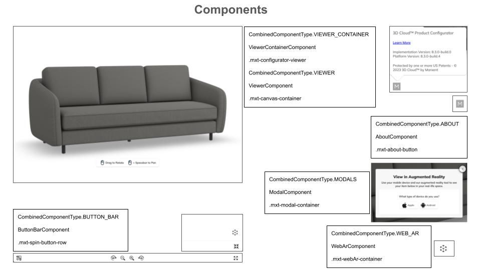
Components Diagram 1
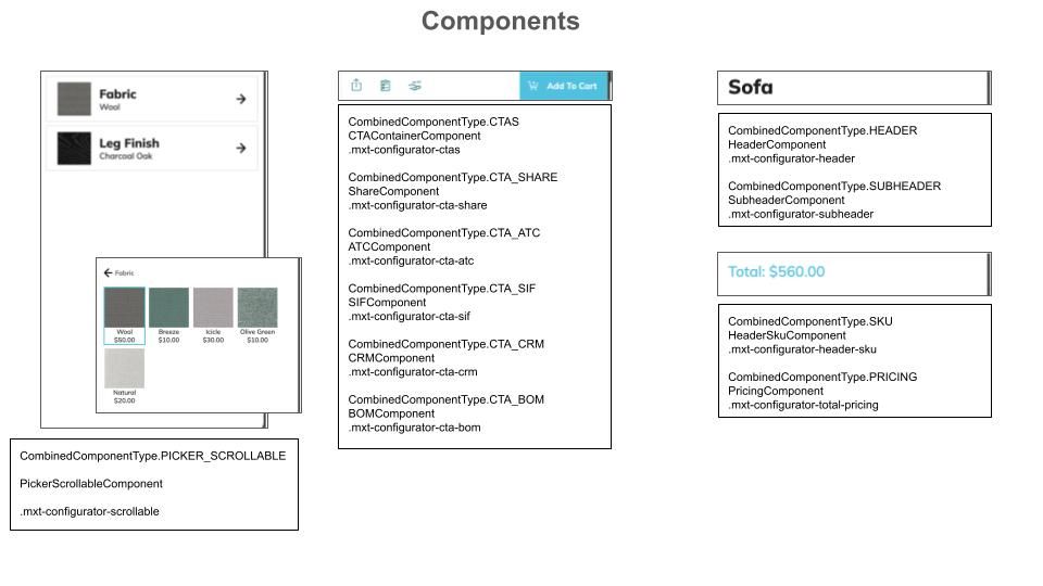
Components Diagram 2
Customizing Component Locations
There is an option parentElements. This allows you to provide a different parent element for any given component type. You do not need to provide a parent element for each; you can pick and choose which ones you need to customize. For example, if you have your own section you want to put your CTAs, you could just provide:
parentElements: {
  ctas?: HTMLElement;
}
It is possible to provide custom parents for everything. However, a much more common use case is to just re-parent several smaller components (such as CTA_SHARE or WEB_AR). In that case, use both the spinCommon.element option to set the main parent over everything, and just define the parentElements that would not fall in their default location.
IF YOU DO NOT PROVIDE spinCommon.element (for example if you need to provide different parents for the picker container component and the viewer container component), then we will not create a root element to house everything else. This is a totally valid case, but If a root is not created, we cannot always automatically handle resize events. There are many edge cases where your parent elements may have been configured in a way that a resize event on one effects the size of the other. As a result, we turn off handling landscape vs portrait mode automatically. IF you believe you have a fairly standard setup, you may turn resizing back on via the option autoResizeAllParents.
Component parents may be updated at runtime via
updateParentElement(key: string | SpinsComponentType | KongComponentType, newParent: HTMLElement, removeOldParent?: boolean): void {or
updateParentElements(newParentElements: MxtKongParentComponentOptions, removeOldParents?: Boolean): void {Disabling Components
Components may be disabled via the option disabledComponents. It is possible to provide non-sensical situations, such as disabling the CTA container but not disabling the CTAs within it. An exception will be thrown in these cases.
In order to disable all picker components (for example if you are building the UI yourself and just using our MxtKongfigurator for the renderer), use the option disableAllPickerComponents.