In this article, we will learn how to use the 3D Product Configurator and 3D Product Configurator Inspection Tool in 3D Cloud:
1. Introduction
The 3D Cloud™ 3D Product Configurator is a platform for product configurators that includes a content management system (CMS) and the front end configurator application for displaying them to users. The content management system is part of the 3D Cloud™ by Marxent and is for building configurators (3D Product Configurator Backend). The front end application can be delivered as a NPM package, via a CDN folder, or an iframe site to be integrated into websites (3D Product Configurator Frontend). The entire platform is data driven allowing for product configurators to be built or modified without having to publish new code.
Product configurators are built using 3D components, steps, and options. 3D components are the parts of the product to be configured. Each component will have one or more 3D mesh/models of the part and optionally one or more materials which can be swapped on that mesh. During the 3D modeling process the product the configurator was created for would be broken down to the parts that need to be swapped or have materials swapped on them. Steps define the choices that a user makes and/or the parts of the SKU. Steps have options, and the options are the choices the user can make or the choices that are made, through dependencies with other steps.
This manual is meant to define the 3D Product Configurator and how to use each part to build, edit, and publish configurators.
2. 3D Cloud™ CMS
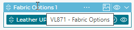
2.1 How to login
To build a 3D Product Configurator users must login using an account that has the appropriate user roles defined in the 3D Cloud™ CMS. To login, navigate to https://cms.3dcloud.io. Enter username and password to access the site and 3D Product Configurator.
2.2 How to open 3D Product Configurator
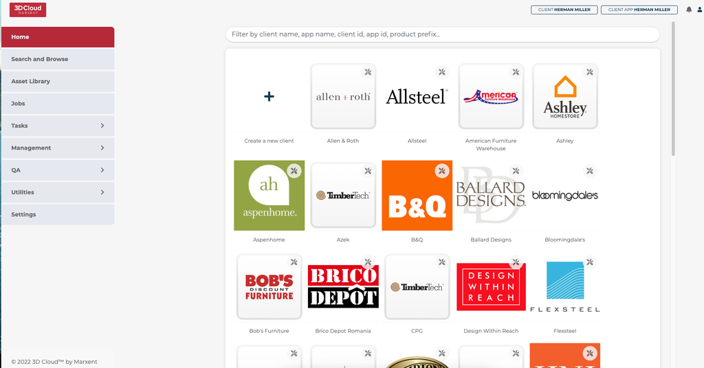
To open 3D Product Configurator a user must select a client in the CMS first. Select the client from the Home screen.
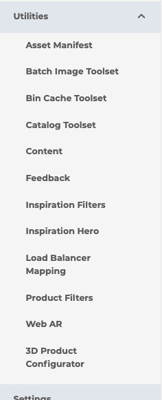
To open 3D Product Configurator, navigate in the left side menu to Utilities -> 3D Product Configurator
3. Configurator and Folder Management
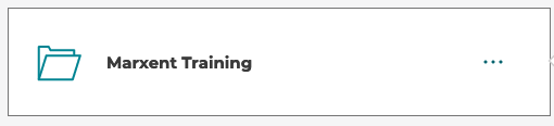
The 3D Product Configurator supports a folder system to store and organize configurators. Users can create, move, rename, or delete folders. Folders can be nested inside other folders and configurations can be created inside any folder or at the top/root level. Folders and configurators can be dragged and dropped to change their parent folder. Dragging onto the back arrow will move them to their parent’s parent folder.
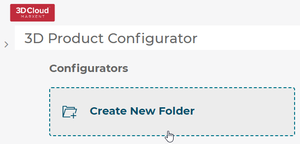
3.1 Create a folder
To create a folder select the Create New Folder button.
3.2 Open a folder
3.3 Renaming, moving, or deleting a folder
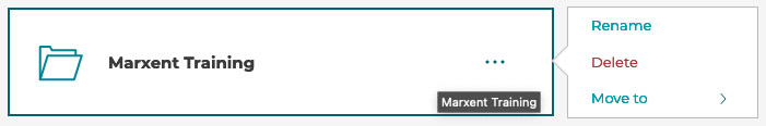
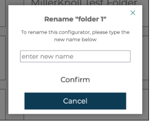
A user can rename, move, or delete a folder by selecting the options menu (... icon) on the folder you wish to edit.
Folders cannot have the same name as another folder. If this is detected, a number will be appended to the folder name. For example:
Original Folder Name
duplicated will be:
Original Folder Name (1)
duplicated again will be:
Original Folder Name (2)
etc
3.4 Creating a configurator
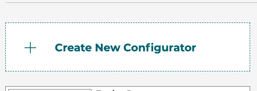
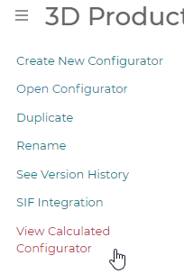
To create a new configurator select Create New Configurator.
3.5 Opening a configurator
To open a configurator click the configurator on the list.
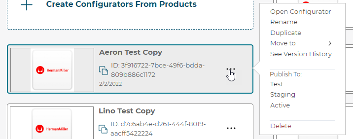
3.6 Rename, duplicate, move, publish, or delete a configurator
A user can rename, duplicate, move, publish, or delete a 3D Product Configurator by selecting the options menu (... icon) on the folder you wish to edit.
3.7 Publishing configurators
Whenever a change is made to a configurator, the configurator is saved automatically. That saved version is called the latest version. The latest version can be previewed in the preview modal.
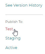
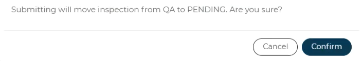
When a Configurator is ready to test in the Test/QA environment, select the option menu and click the Publish To: Test option.
A pop-up will appear asking the user to Confirm the promotion:
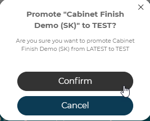
This will register the current version as the Test version of the configurator and will be available to 3D Product Configurator front end builds pointed at the Test environment.
Observe the Configurator is promoted to TEST, with the most recent changes in LATEST.
3D Product Configurators promoted to the Test environment will automatically show up in the default queue of the 3D Product Configurator Inspection Tool in the QA state.
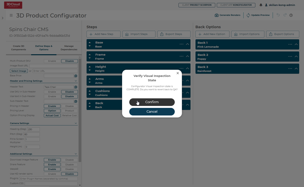
If your configurator has already been set to COMPLETE status but a new TEST version has been promoted, a special pop-up will appear asking if the Kong Admin wants to revert back to QA state automatically.
The staging version is meant to be for external review and certification testing. To publish to a staging version click the Publish To: Staging button in the option menu.
The active version is the production version. This version is used with 3D Product Configurator front end builds pointed at the production environment.
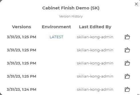
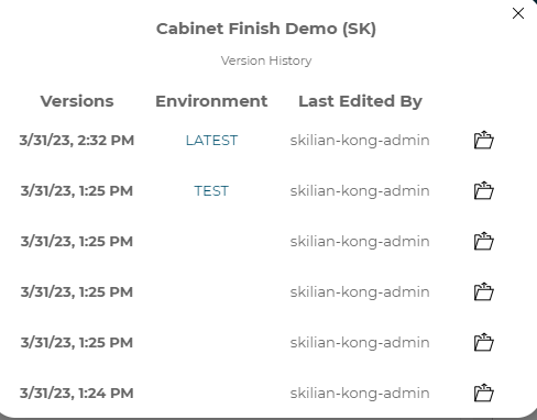
3.8 Version history and restoring versions
Whenever a change is made to a configurator, the configurator is saved automatically. That saved version is called the latest version. Each time a change is made a new version is created in the version history. If you would like to view a previous version you can open the version history from the options menu. From the version history modal
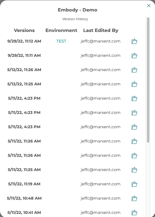
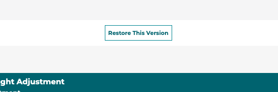
Once a version is open it can be restored, making it the latest version, by clicking the Restore This Version button at the top of the open configurator.
4. Create 3D Components
4.1 What is a 3D Component
3D Components are the 3D parts that are combined through the 3D Product
Configurator to define a 3D product. Any part or component of a product that needs to be swapped or material changed should be defined as a separate component entry in the 3D Product Configurator.
Components in the 3D Product Configurator consist of a list of meshes, a list of materials, and a list of material slots for a specific component name. You also define positions for the mesh, and each position defined will create an instance of the component in the 3D scene.
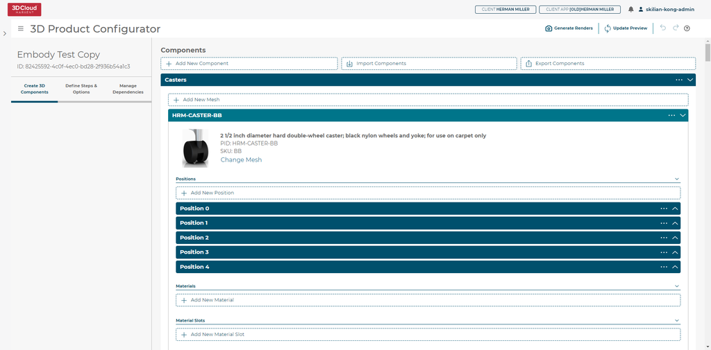
4.2 Defining a component
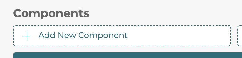
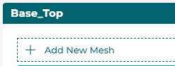
To create a new component click the Add New Component button.
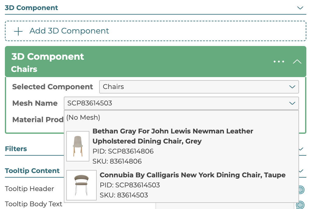
4.2.1 Meshes
The primary part of a component is a list of one or more meshes. These are linked to Product IDs (PIDs) which are the 3D Cloud™ unique IDs for 3D models/materials in the 3D Cloud™ CMS.
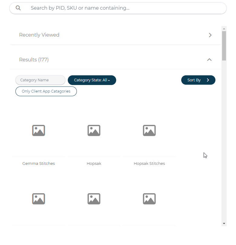
To add a mesh to a component click the Add New Mesh button found inside the component box. Then in the search and browse modal that opens, select the product you wish to pick for the mesh. You can rename the mesh by clicking the header bar text and typing in your custom name, this can be useful when referencing in the options later.
4.2.1.1 Positions
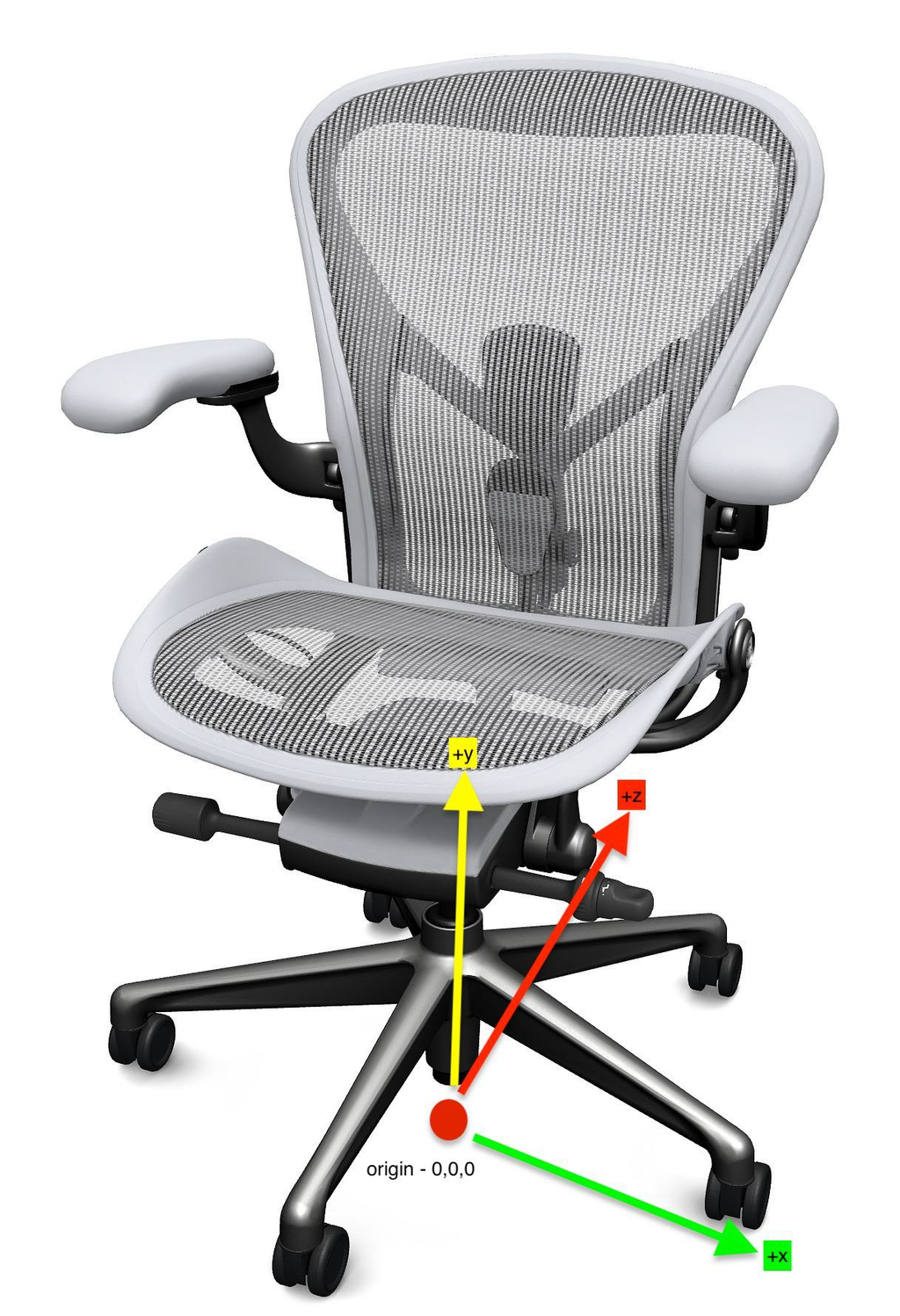
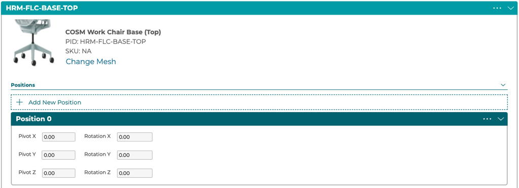
Each mesh in a component needs at least one position defined. The position is the location the mesh will be placed in the 3D scene relative to the origin, which is the bottom center of the scene. Most will work with 0,0,0 position and rotations defined. More than one position can be defined to instantiate more than one instance of this mesh in the 3D scene, one at each position defined. To add a new position click the Add New Position button and enter your position and rotation values in the fields.
4.2.1.2 Materials
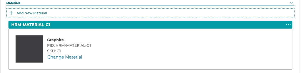
Materials are defined for a mesh as a list linked to Product IDs that correspond to 3D Cloud™ products with material data. No materials are required to be defined. To add a new material click the Add New Material button and choose your material product ID in the search and browse modal. Select the “...” menu to delete a material.
4.2.1.3 Material Slots
3D Product Configurator supports swapping more than one material on a single 3D Component. Each material that can swap is called a material slot and needs to be defined in the component, allowing in the options for a user to assign a material to a specific slot. These slots must match up to material slots defined in the mesh itself during the 3D content creation process. Select the “...” menu to delete a slot.

4.3 Bulk creation and editing
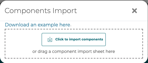
To bulk create or edit 3D Components use the Import/Export tool. The Import/Export tool uses Excel spreadsheets to allow for editing a large number of 3D Components in a spreadsheet and the transfer from one configuration to another.

To export to an Excel Spreadsheet of the current 3D Components setup in your open configurator select the Export Components button.
To import a spreadsheet containing new components or edits to existing components select the Import Components button.
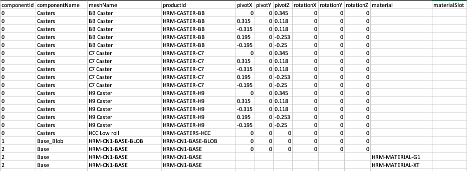
Each row in the spreadsheet will be associated with a component id and be either a row representing a mesh or a row representing a material. Material rows are also associated with the mesh name. An example of the format:
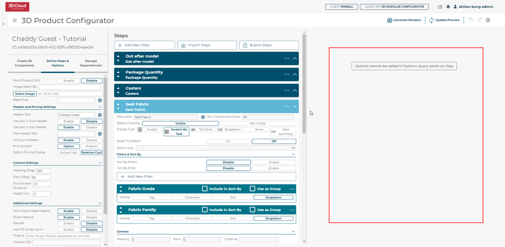
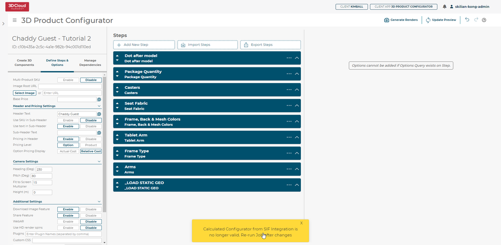
5. Define Steps & Options
The configuration builder allows for a user to define the settings for the entire configuration being built along with the steps and options available to use.
A step in 3D Product Configurator is a choice in a configurator that is made either directly by a user's input or through dependency logic linking to other user choices.
An option is one of the choices within a particular step that a user or dependency can choose from. Options are associated with the 3D components defined previously in this manual and the steps and options defined at any given point define what would be visible in the 3D viewer through linking 3D components to the options.
Steps and options make up the core parts of a configuration picker. We use these to define dependencies and rules in the Manage Dependencies section documented later in this manual.
5.1 Configurator Options
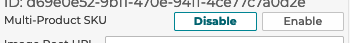
5.1.1 Multi-Product SKU
Specifying that a configurator should support multiple SKUs allows for the configurator to display a list of product SKUs, not just one resolved SKU. This works with the step display type Item Summary to support multiple resolved skus.
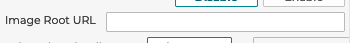
5.1.2 Image Root URL
Defining an Image Root URL allows for direct definition of image urls in each step without needing to enter a full URL each time. This can be left blank when using the built in image picker and upload tools in 3D Product Configurator.
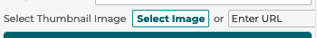
5.1.3 Select Thumbnail Image
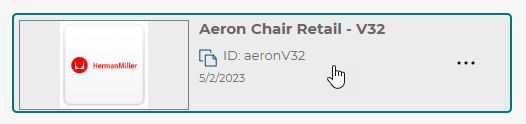
An image can be uploaded or linked to that will be used in the folder/configurator browser to represent what the particular configurator is.
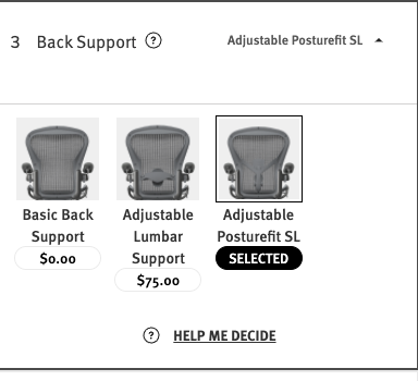
5.1.4 Base Price
The base price is the fixed price that all other options are added to to calculate the final price.

5.1.5 Header and Price Settings
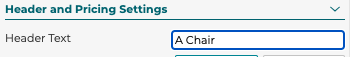
5.1.5.1 Header Text
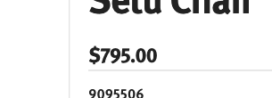
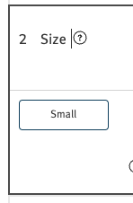
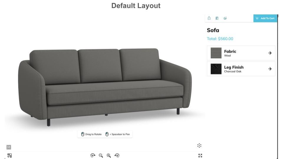
The header text is the main title text that shows up in the configurator to the user. See example here:

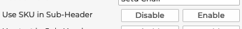
5.1.5.2 Use SKU in Sub-Header
If you want the SKU to appear in the header / footer on mobile devices, select Enable.

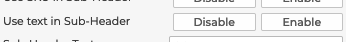
5.1.5.3 Use text in Sub-Header
If you want the sub-header text defined below to appear in the header then select Enable.
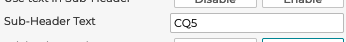
5.1.5.4 Sub-Header Text
Enter any text you want to appear in the header here. This will only be visible in the configurator header if the Use text in Sub-Header is set to Enable.
5.1.5.5 Pricing in Header
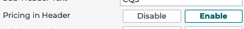
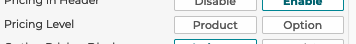
If you want the total price to appear in the header select Enable.
5.1.5.6 Pricing Level
3D Product Configurator allows for two types of pricing levels to be set up in a configurator. Product level or option level can be chosen.
Product level pricing only shows the total product price to the user of the configurator.
Option level pricing shows the product level total price and also shows the price of each option in each step.
5.1.5.7 Option Pricing Display
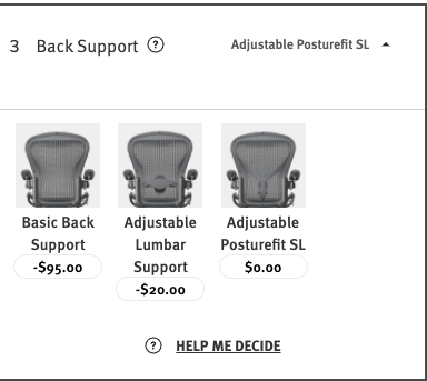
When showing option level pricing there are two types of option prices you can pick from, relative cost and actual cost.
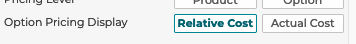
Relative cost will show the price difference between the current option and the option you can pick.
Actual cost will show the total price added to the base price by an option and not relative to other options.
5.1.6 Camera Settings
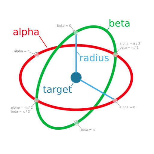
3D Product Configurator allows for customizing the default camera position in the 3D viewer on first entry into a configurator.
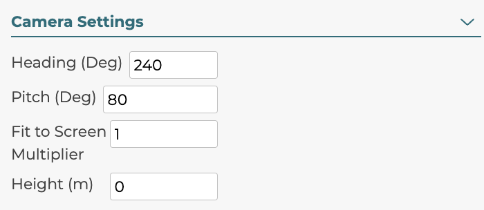
5.1.6.1 Heading
Heading is the rotation around the vertical axis in degrees. Adjusting heading will change where the camera starts around the product, the camera will always face the product. This value should be between 0 and 360 and rotates around the product counter-clockwise.
5.1.6.2 Pitch
Pitch is the rotation around the horizontal axis in degrees. Adjusting pitch will change how high the camera is relative to the product and the camera will always still face the product. The pitch should be between 0 and 90 with 90 being looking straight at the front of the product and 0 being above the product.
5.1.6.3 Fit to Screen Multiplier
Fit to Screen Multiplier is the value defining how much of the product appears in the 3D view by default. A value of 1 would have the product filling the view by default. A value of 2 would have the product be half as big as the view.
5.1.6.4 Height
Height is the length in meters from the center of the product that the camera is looking at. So instead of the camera looking at the center of the product, the height can adjust the point to be higher or lower.
5.1.7 Additional Settings
5.1.7.1 Download Image Feature
Toggles if the download image button is on or off in the configurator.


5.1.7.2 Share Feature
Toggles if the share button is on or off in the configurator.


5.1.7.3 WebAR
3D Product Configurator supports on demand generation of USDZ and GLB file formats for use with WebAR. WebAR also requires the front end build must also be set up to support WebAR and the client must be subscribed to the service.

5.1.7.4 HD Render Spins
The 3D Product Configurator supports showing the product in a rendered spin in place of a 3D WebGl based view. Enable in your configurator when this feature is available to show 2D rendered spins in place of 3D. For more information, see Section 8.

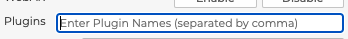
5.1.7.5 Plugins
The 3D Product Configurator architecture allows for client implementations of the 3D Product Configurator platform to include custom code via plugins. When defining a configuration you can add plugin names here to activate them. To add more than one enter the names comma separated with no spaces.
5.1.7.6 Custom CSS
The 3D Product Configurator architecture allows for CSS overrides to be passed down in the configuration file to the front end to change colors, fonts, and sizes.
String should be valid formatted CSS, for example:
:root{
  --mxt-loading-background-color:green;
  --mxt-loading-icon-color: blue;
}
A list of css variables supported:
Variable Name | Default | Notes |
|---|---|---|
|
| The background color of the loading progress bar (not of the progress bar itself, but the background behind it), default is transparent. Can also be set via runtime option |
|
| The color of the lighter stripes on the loading progress bar. The darker stripes are achieved by putting a mostly transparent black background over this color. Can also be set via a runtime option |
|
| NOT the background color of the renderer (that is set via the backgroundColor field on the Configurator model, or via backgroundColor runtime option). This is instead the background color of ALL other UI (toolbar under the renderer, and the picker). Modals are an exception to this and always have a white background. |
|
| Text color used within the application |
|
| Generally set via runtime option, but can be set per Configurator model here. |
|
| Must be a font that is loaded on the page somehow; this just sets the font, it does not load it. |
Font sizes; grouping these together for ease of reading; see defaults---> | | |
|
| The border used around different steps in the picker. |
|
| In portrait, the height of the viewer container. This only used if not setting up multiple parent elements for components (see #11.5-Components), or if you use the |
|
| In portrait, the height of the picker container. This only used if not setting up multiple parent elements for components (see #11.5-Components), or if you use the |
|
| In landscape, the width of the picker container. The viewer container will any available width remaining. This only used if not setting up multiple parent elements for components (see #11.5-Components), or if you use the |
You can also try to set directly on CSS classes, but those are more subject to change. A current diagram of our component layout lives in #11.5-Components.
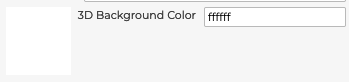
5.1.7.7 3D Background Color
The 3D Background Color field allows for changing the default background color in the 3D view. You can enter a Hex Code color value and see a preview.
5.1.7.8 Custom Metadata
For custom plugins and features you can add custom data to the Custom Meta Data field in the configuration. This is a string field that can contain almost any data you need for the front end application.

5.2 Steps
A step in 3D Product Configurator is a choice in a configurator that is made either directly by a user's input or through dependency logic linking to other user choices. Configurators all have one or more steps with one or more options available on each step.
5.2.1.1 Creating Steps & Step Options from SIF Marketing files
3D Product Configurators can have their Steps and Step Options automatically created by uploading a SIF Marketing TOP, KEY and OPT file directly inside the Configurator (see video below or continue for detailed explanation with screenshots):
The dependency tree flow will still need to be setup manually.
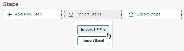
To do this, first click the Import Steps button above the steps and select Import SIF File.
Next you will need to enter the three files that make up a SIF data set.
You do not need to know which SIF file is your TOP, KEY or OPT file. Our system will intelligently detect each file automatically
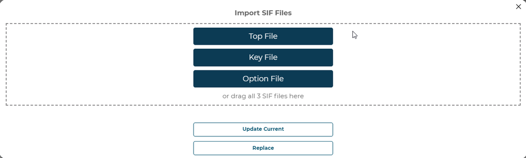
Once the SIF files are uploaded a user will have the ability to assign steps found in the SIF data to steps in the configurator. A user can pick the entry level in the file to build steps from. Once a level is selected at the top of the modal, a user can add steps to the configurator if you choose Replace. Or you will see the steps in the configurator to update.
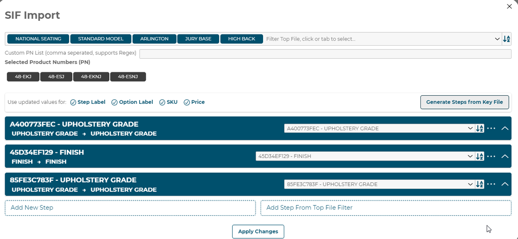
Once you have the options and steps assigned you can click Apply Changes to import the pricing data into your configurator.
5.2.1.2 Ingesting SIF data on a recurring schedule
Configurators can be setup to ingest SIF marketing data on a recurring Cloud Based Firestore schedule using custom client specific jobs. This allows for custom calculated steps and options based on the most up to date SIF marketing data stored in the 3D Cloud™️ SIF data repository.
Available to Kong Admins and Editors.
The SIF marketing files and jobs must exist in Firestore prior to attempting a sif-ingestion.
The configurator must be built with 3D components, steps, options, and dependencies as described above before running a SIF ingestion job against it. The jobs will not build configurators from scratch.
A menu will slideout from the left that has a button for SIF Integration:
Pressing the SIF Integration button opens a preview modal to setup your SIF Integration Settings:
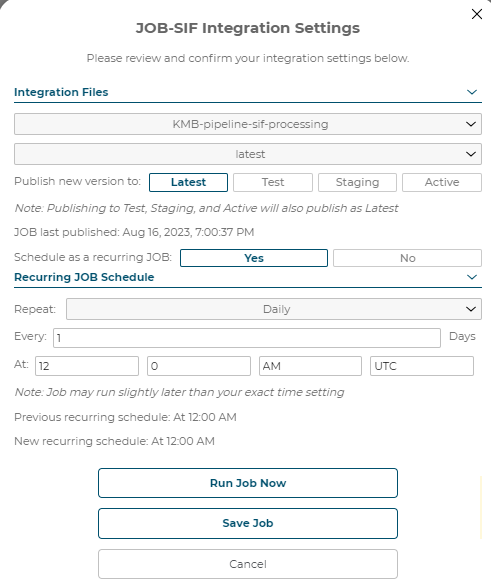
5.2.1.3 SIF Integration Settings
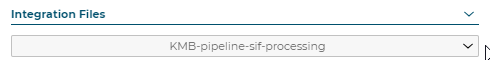
Integration Files: The client specific SIF pipeline must exist already or the dropdown will be empty:
Latest/Staging/Active SIF Batches: These batches link directly to SIF TOP, KEY and OPT marketing files.
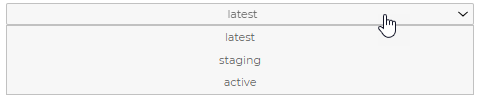
Not to be confused with Latest/Test/Staging/Active in 3D Product Configurator version files.
Publish new 3D Product Configurator version to: Latest/Test/Staging/Active:
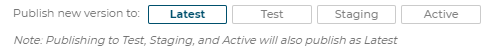
Note: Publishing to Test, Staging, and Active will also publish as Latest
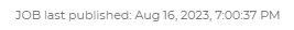
Job last published: Month, Day, Year, Time
Schedule as a recurring job: Yes/No

Selecting No will create a job but will not run it unless you choose to run it now manually. Selecting Yes will create the job and run the recurring schedule.
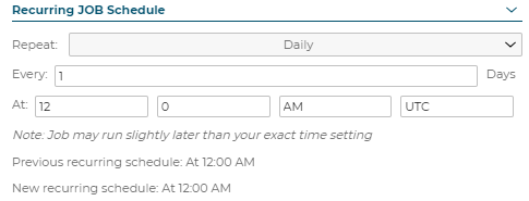
Recurring Job Schedule: Repeat Daily
Recurring Job Schedule: Repeat Weekly
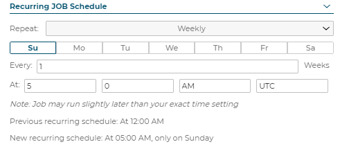
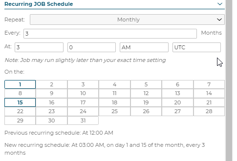
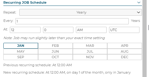
Note: Job may run slightly later than your exact time setting
Recurring Job Schedule: Repeat Monthly
Recurring Job Schedule: Repeat Yearly
5.2.1.4 Create SIF Job
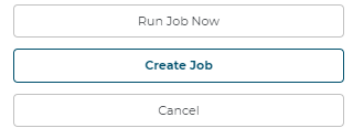
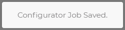
After you configure the desired settings, press the Create Job button:
Users cannot run jobs until creating them
A toast message will pop-up at the bottom of the screen that says Configurator Job Created:
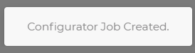
Toast Notification appears
5.2.1.5 Run SIF Job Now
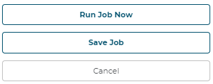
Now that the job has been created, press Run Job Now to kick off the job immediately or wait until the desired date/time and the job will kick off automatically.
A notification will appear at the top right of the Configurator displaying job progress:
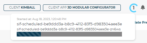
The job is titled
sif-scheduledfollowed by your 3D Product Configuratoruuid.sif-scheduled-be9dd3a-b8c9-4112-83f5-d983504aee3e
When the job completes, the status will update in real-time with a date/timestamp:
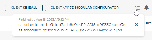
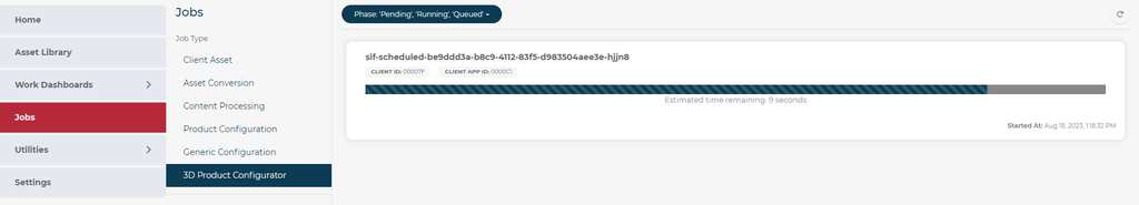
The status of the sif-scheduled job will also appear on the 3D Cloud Jobs Page under the 3D Product Configurator section:
5.2.1.6 View Calculated Configurator
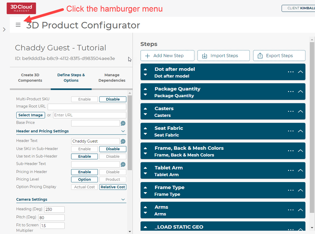
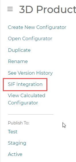
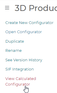
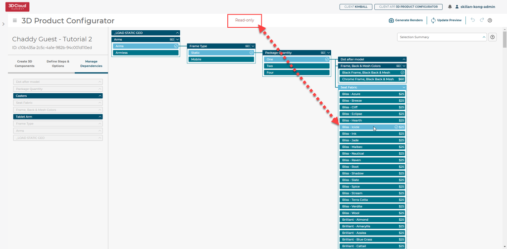
Once the ingestion has been performed, the ingested data can be viewed in a special read-only mode called View Calculated Configurator. To turn this mode on, press the hamburger menu at the top left of any Configurator and click “View Calculated Configurator”:
It’s important to understand the difference between Viewing Calculating Configurators in read-only mode and viewing Configurators normally.
Before pressing Viewing Calculated Configurator (Normal View):
After pressing Viewing Calculated Configurator (SIF Ingested View):
Observe the Options Queries are populated automatically!
Let’s open one of them up to see what was ingested:
Option Name
SKU Component Code
Option Image
3D Component (Selected Component)
3D Component (Mesh Name)
3D Component (Material Product ID)
Fabric Grade
Fabric Family
5.2.1.7 SIF Ingested Dependency Tree
Configurators must be setup as a Parent/Child relationship down the Dependency Tree for Step Options
Existing Configurators may need to be reconfigured in order to work properly.
Set your default Options Query for the sif-ingested Step Option in the Dependency Tree:
Press View Calculated Configurator in the hamburger menu at the top left:
Observe we are now in Read-Only mode and all sif-ingested Step Options pricing data is visible!
If a Product has a price of $0, it will not display a price difference at all:
If a Product is grayed out, that means it is not in a Product Filter category or the data is invalid in some way.
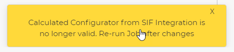
5.2.1.8 Updating existing SIF jobs
Every version save of a Configurator will be validated against existing sif-integrations. If a change is detected, a yellow toast notification will appear at the bottom of the Configurator:
Close up View of Config with old data
SIF scheduled jobs can be updated by returning to the SIF Integration Settings, updating the desired parameters and hitting Save Job.
Toast notification appears
5.2.1.9 Duplicating SIF Ingested Configurators for Re-Use
After duplicating SIF Ingested Configurator, you must make at least 1 version save change inside the Configurator for the original Configurator’s sif-ingested data to be wiped out.
Failure to do this will result in a mismatch of sif-ingested Step Options because the Configurator will have multiple Calculated Rules and Calculated Steps from multiple sif ingestions.
This is because sif-scheduled jobs are linked directly to that specific Configurator’s uuid. This means if you duplicate a Configurator that was already sif-ingested, you will need to create a new sif-scheduled job and run it again to begin a new recurring schedule.
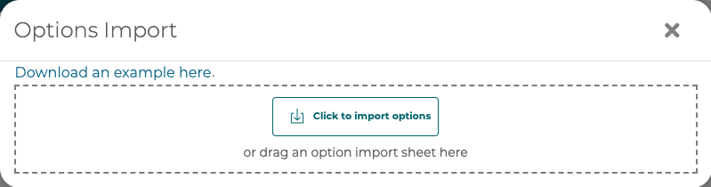
5.2.2 Import/Export data from/to a spreadsheet
3D Product Configurator supports exporting steps to an Excel spreadsheet or importing data from a spreadsheet into an existing configurator. Export to a spreadsheet by clicking the Export Steps button. To import from an Excel spreadsheet, first click the Import Steps button above the steps and select Import Excel.
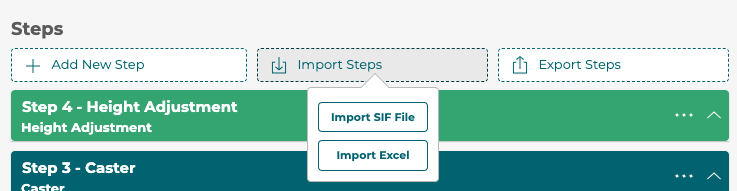
Choose a spreadsheet to import or drag and drop into the modal.
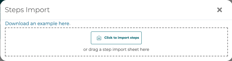
Preview the changes found in the spreadsheet and import those changes or cancel.
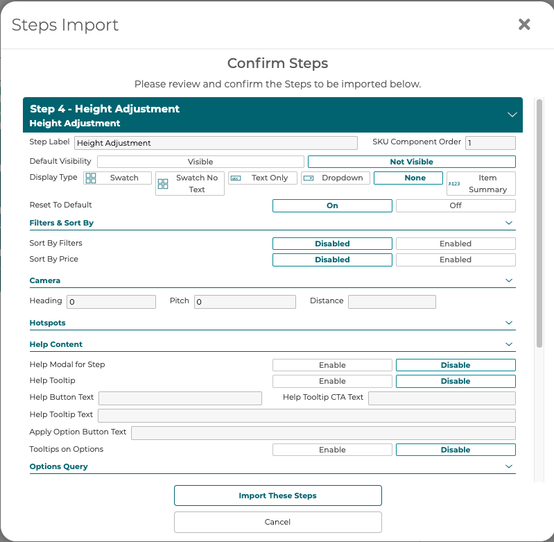
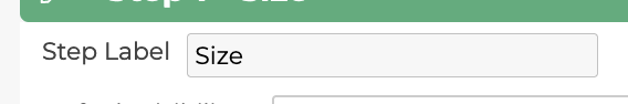
5.2.3 Step Label
The step label is the name of the step shown in the configurator to the user.
Step Labels also appear automatically if hovering over a Step Name in the Dependency Tree:
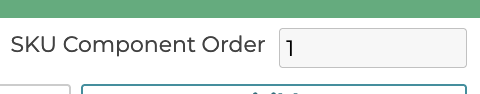
5.2.4 SKU Component Order
The SKU component order defines what place in the SKU this step’s option SKU component code gets added. The order is ascending.
SKU Component Order only affects BOM and Pricing.
The Dependency Tree controls the display order in the actual applications.
5.2.5 Display Type

The display type of the step defines how the steps options are presented in the configurator to the user.
The default Display Type for new Steps is always set to Swatch. This includes Steps generated via SIF Import.
● Swatch: Displays the options as image swatches or hexcode swatches
● Text Only: Displays each option as a text button to click
● Dropdown: Displays the options in a drop down menu for the user to select
● None: For steps that should not be visible to the user, only used in SKU resolution
● Item Summary: Used with multi-sku to show an item number/sku of the component defined in the steps above this one.
5.2.6 Reset to Default
When a step is set up as a parent dependency in the Manage Dependencies section this setting will define what happens when an option is chosen and children dependencies have specific options available or not available. If it is On, when an option is chosen all children steps will have their choice changed to the defined default choice. If Off, the children will stay the same unless the current option is no longer valid, in the case of an invalid option it will fall back to the default.

5.2.7 Filters & Sort By
5.2.7.1 Sort By Filters
Defines if sorting by filters for this step here are enabled. This will also turn on the sorting functionality in the front end step as needed.
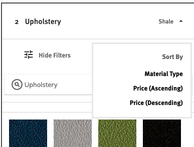
5.2.7.2 Sort By Price
Defines if sorting by price for this step is enabled. This will turn on the front end sorting functionality as needed and show price as a choice.
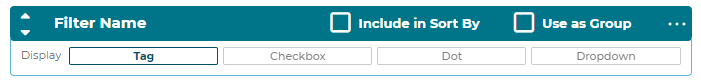
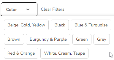
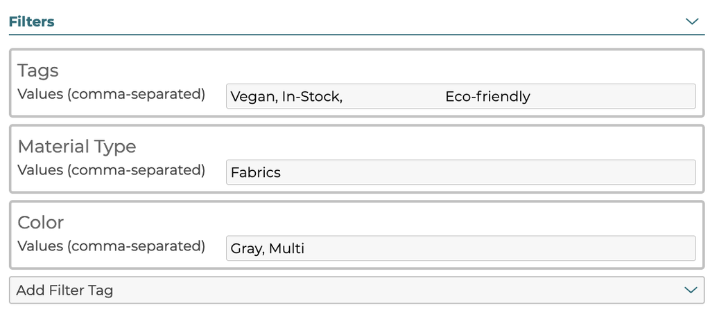
5.2.7.3 Filters
Filters can be defined for the step. Each filter can have either the include in sort
by or use as group checked. Only one or none of these can be checked at a time.
Each filter has a name and display type defined for it.
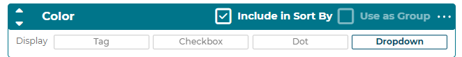
● Dot: Display the option filters as radio “dot” buttons
● Checkbox: Display the option filters as checkboxes
● Tag: Display the option filters as text buttons
● Dropdown: Display the option filters as text buttons
Option Filter order is respected. This means if you setup your Option Filters in a specific order in your 3D Product Configurator, it will also display in the same order on the front-end application.
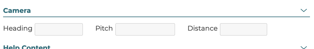
5.2.8 Camera
Camera angles in the 3D view can be set for a configurator for each step optionally. If values are defined in these fields then when a user selects an option in this step the camera will move to that orientation. Leave these fields blank to keep the camera from moving when a user selects an option in this step. A distance value that is larger than 0 must be defined for the camera step settings to be used on the front end.
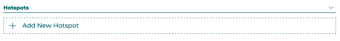
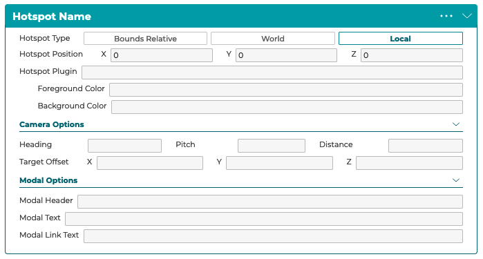
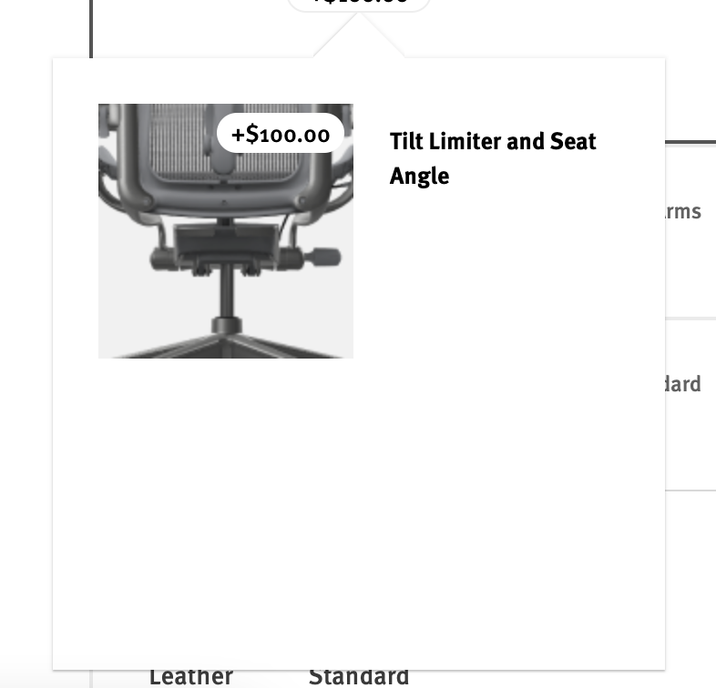
5.2.9 Hotspots
One or more hotspots can be added to a step to highlight key information or components of a product. Click the Add New Hotspot button to create a new hotspot on a step.
● Hotspot Type and Hotspot Position defines if the hotspot is positioned relative to the world origin, local model origin, or relative to the bounds of the model.
● The Hotspot Plugin field is used to define custom data for custom hotspot plugins.
● Foreground Color defines the primary icon color and Background Color defines the secondary background color.
● Camera Options define what the camera will do when a user clicks the hotpot icon. If these values are not defined then the camera will not move.
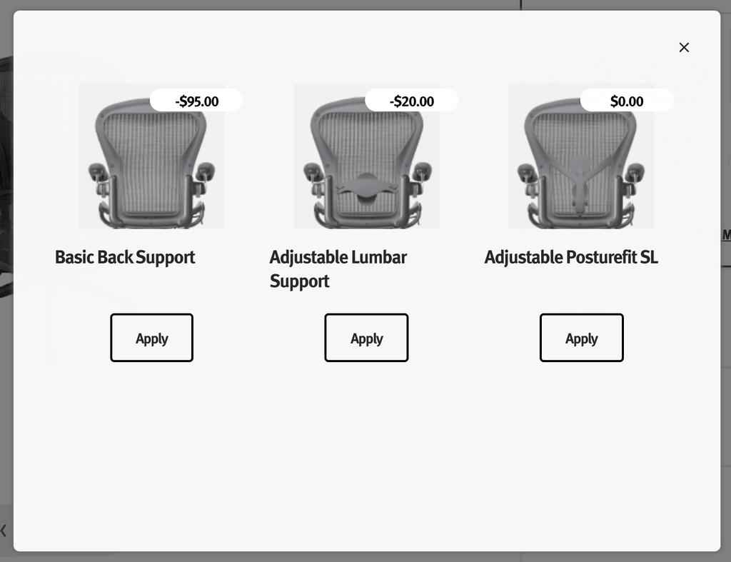
● Modal Options define what text appears in the hotspot modal that opens when a user clicks the hotspot.
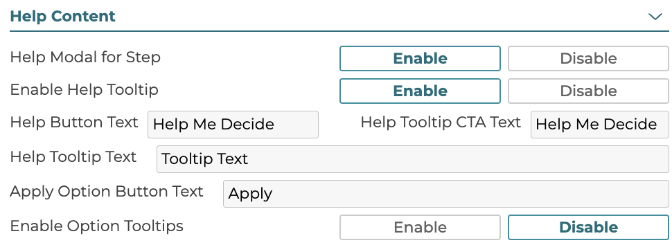
5.2.10 Help Content
Help text can be defined for the step which appears in the Help Me Decide modal. The help modal and the help tooltip can also be disabled or enabled. Enable Option Tooltips will control if a tooltip appears when hovering the mouse over individual options in this step.
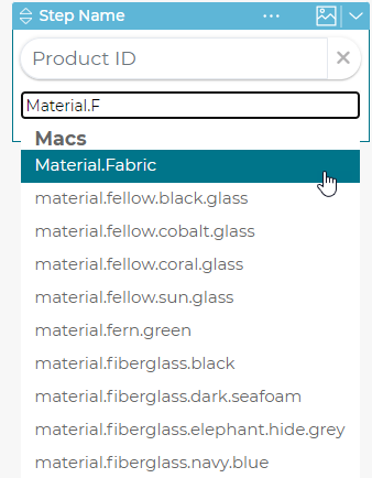
5.2.11 Option Query
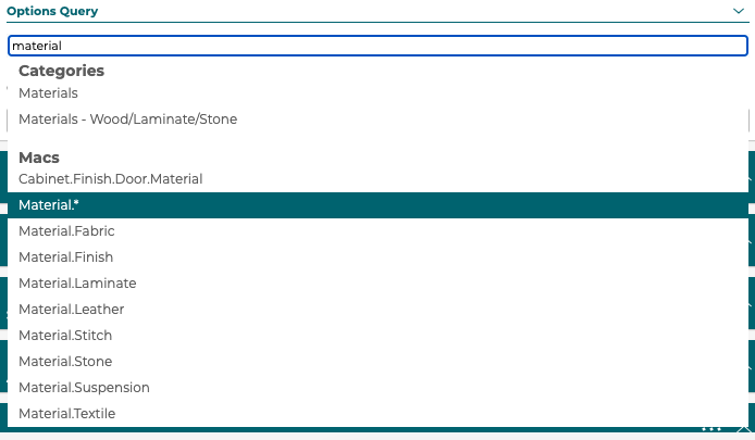
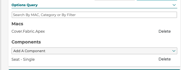
3D Product Configurator supports defining step options through a query against products in the 3D Cloud™ instead of manually defining them in the 3D Product Configurator UX.
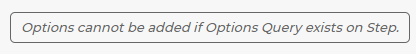
If a step has no options defined then a user can define queries by category and/or Marxent Assembly Classifier (MAC).
Along with a query the 3D Component that these options change the material on needs to be selected.
Steps with option queries use the product data in the 3D Cloud™ database to setup filter values, SKU code, and price. Using options queries only works with material swapping on a 3D Component, not mesh product swapping.
5.2.12 Step Properties
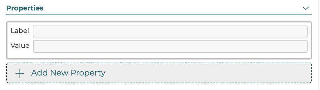
Properties consisting of key value pairs can be defined for steps to be used with custom plugins and features in 3D Product Configurators.
Label: ‘matchingId’
Value: String used when a configurator is part of a modular configurator to match step options across configurators in a modular design when labels might not match correctly.
Label: 'searchplaceholder'
Value: String used as placeholder text in search box on this step
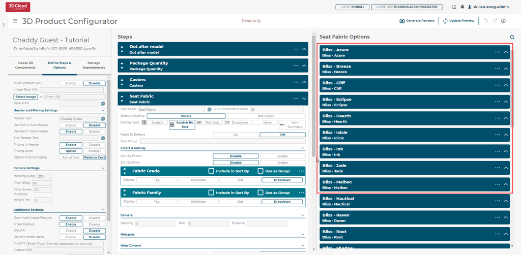
5.3 Options
An option is one of the choices within a particular step that a user or dependency can choose from. Options are associated with the 3D components defined previously in this manual and the steps and options defined at any given point define what would be visible in the 3D viewer through linking 3D components to the options.
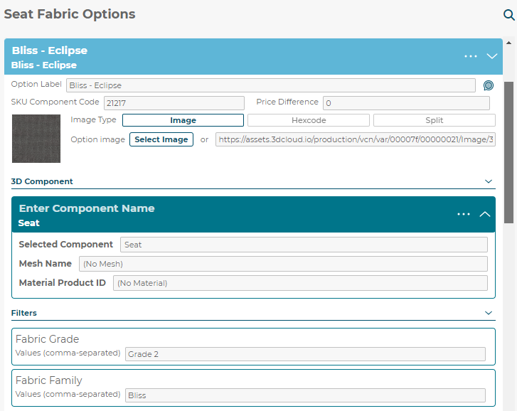
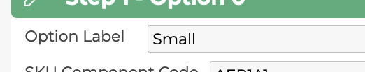
5.3.1 Option Label
The option label is the option name displayed in the configurator to the user.
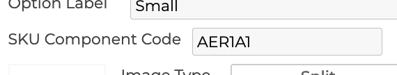
5.3.2 SKU Component Code
The SKU component code is the part of the SKU that this option provides to the fully resolved SKU.
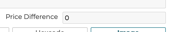
5.3.3 Price Difference
The price difference of the option. This value should be the actual price of this option that gets added to the base price.
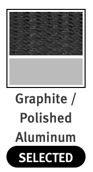
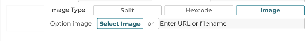
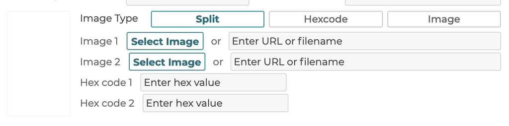
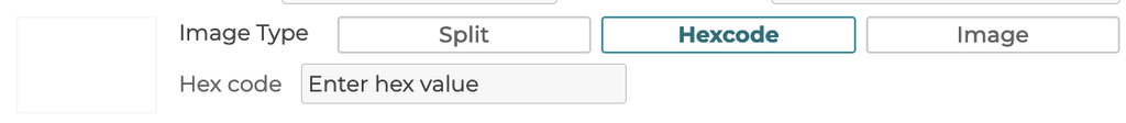
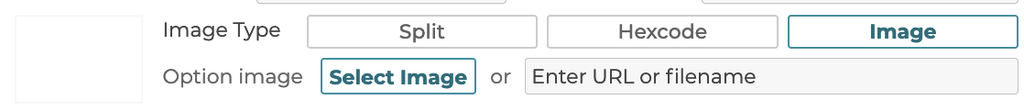
5.3.4 Image Type
When a display type is selected as swatch for the step, then the image/swatch is defined here.
5.3.4.1 Split
3D Product Configurator supports a split swatch type that has an upper and lower defined image or color value. When this type is selected, 2 images, 2 colors, or a combination of the 2 can be defined.
5.3.4.2 Hex code
Selecting Hexcode allows for a color to be defined by a hex code value: https://www.w3schools.com/colors/colors_hexadecimal.asp
5.3.4.3 Image
Selecting the image type allows a single image to be uploaded or defined by a url link.
5.3.5 3D Component
When an option is swapped, one or more 3D components can be changed, swapped, or removed. These changes are defined in the render components list. The choices are pulled from the components defined in the component manager. Please note that if a component has been defined and you now have a none option that would remove the 3d component you should define a none Product in 3D Cloud™ and apply it to the none option, do not just remove the component product.
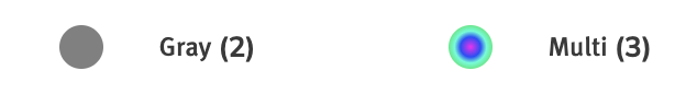
5.3.6 Filters
When a step has filters defined, each option can have one or more filter tags defined for each step filter. These are defined by selecting Add Filter Tag and adding values to the filter in the text box. Multiple values can be added, comma delimited.
When the filter type defined in the step is Dot, add color data to the filter value to assign a correct color to the UI dot icon by appending “|”="" or="" “|multi”="" to="" your="">
5.3.7 Tooltip Content
For each option tooltip text can be defined to be displayed in the configurator when an option is hovered over.
5.3.7.1 Tooltip Header
The tooltip header text.
5.3.7.2 Tooltip Body Text
The tooltip body text.
5.3.8 Help Content
These text values are not used.
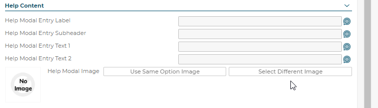
5.3.8.1 Help Modal Entry Label
5.3.8.2 Help Modal Entry Subheader
5.3.8.3 Help Modal Entry Text 1
5.3.8.4 Help Modal Entry Text 2
5.3.9 - Properties
The option properties are label:value pairs that allow for different data to be defined for use in the configurator front ends. To add a new property click the Add New Property button and enter the label and value entries.
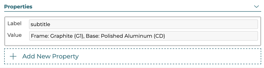
Label: 'help-label'
Controls label that goes below option name in the help modal.
Label: 'help'
Bulleted text making up body of text for option. Can have more than one 'help' bullet point assigned to a single option in the help modal.
5.3.10 Import/Export from/to a spreadsheet
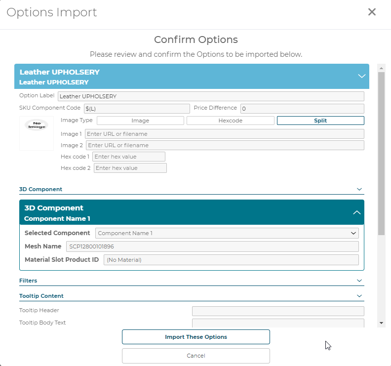
To export your current options to a spreadsheet click the Export Options button above the options in an open configurator.
To import options from a spreadsheet click the Import Options button and pick a spreadsheet to import or drag and drop your file.
A confirmation preview modal will appear where a user can see the option data being imported and can import or cancel.
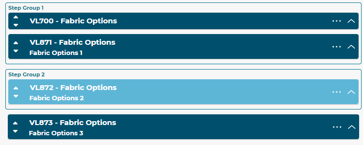
5.3.11 Step Groups
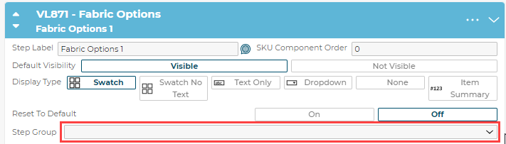
Step Groups allow users to group steps together. The dropdown menu also functions as an input field to create new Step Groups and select Existing Groups. Once a Step has been added to a group, the Step Group label will display above the Steps in that group.
In the example below, 2 Steps are in Step Group 1, and another Step is in Step Group 2, while a final Step is not in any Step Group at all.
5.4 Internalization and translation
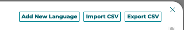
3D Product Configurator supports translated text and pricing for configurator, step, and option fields that appear to the front end users. The easy to use interface built into the 3D Product Configurator CMS allows for configurator builds to define multiple languages and then apply translations for each language for each field. The 3D Product Configurator also supports bulk export and import via CSV files.
To open the languages modal click the button next to any field that supports translation:

Language Modal Button
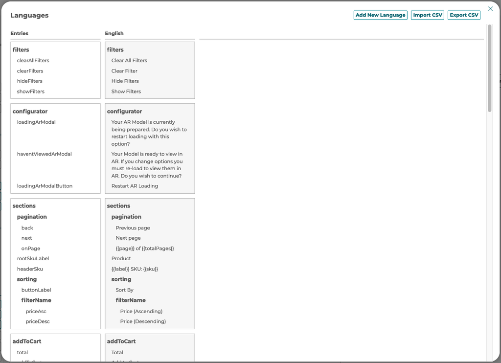
To add a new language select the button at the top right of the languages modal. Languages are associated with the standard web language codes with regions. A user can also Import or Export CSV of the translations using the buttons.
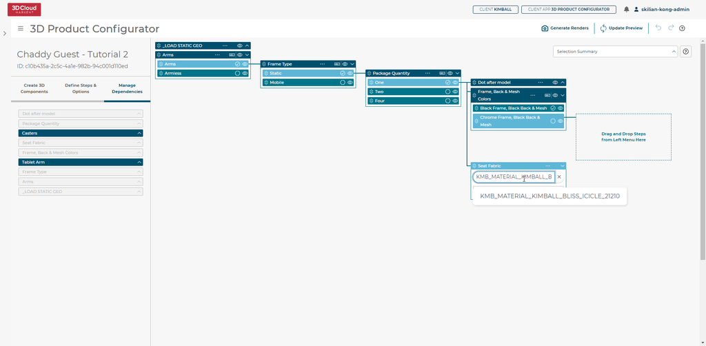
6. Manage Dependencies
Managing Dependencies in 3D Product Configurator is for building the tree of dependencies between steps and options. Building a dependency tree is required for a configurator to work.
The tree is built left to right and top to bottom. The top most steps appear first in the order in the front end configurator. If the steps in a configurator do not depend on other step choices then all steps can live in the 2nd from left column and no further dependencies are needed to define the configurator. When choices made in a step affect which steps or options within another step are available then children dependencies need to be defined.
6.1 Defining Dependency Tree
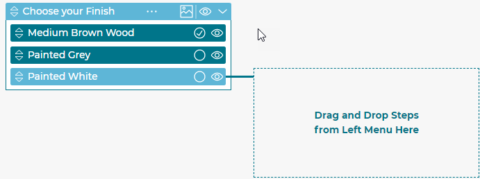
The dependency manager operates off a drag and drop interface. The list of steps on the far left are the steps defined in the configuration builder. A user can click and drag these steps into the area to the right and drop them to add steps to the configurator. Each level of the dependency tree is another column going to the right. The step/option selected in the column to the left defines which parent a step dropped to the right will have. The selected step/option is a bright green. When going down levels in the tree you will see each level selected. If a step is not in the dependency tree it will not be used in the configurator you are building. For a particular branch only one instance of a step can exist.
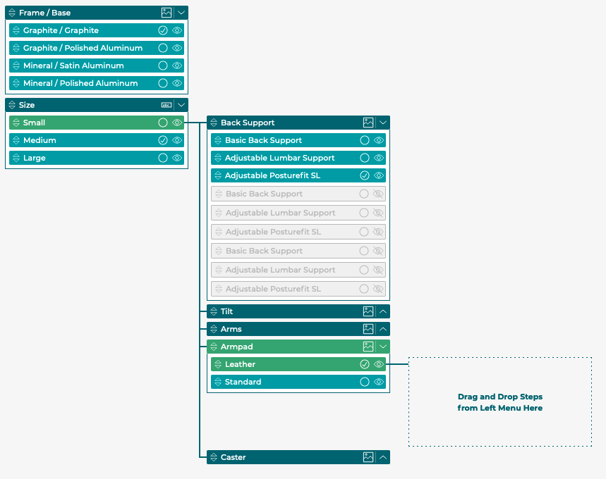
6.2 Steps and Step Order
Step order can be arranged by dragging steps by the arrow icons:
Arrows can be moved up and down within a column. Steps that live as children will be ordered below their parent step but above any steps below their parent at the parents level.
6.3 Options
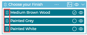
6.3.1 Defaults
Choose which option in a step is the default by clicking the circle icon causing it to be checked.
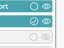
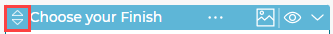
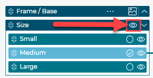
6.3.2 Visibility
There are 3 states of visibility you can choose for each option on a step.
Visible:

Hidden:

Visible but not pickable:

All three options can be toggled in bulk using the icon on the Step.
6.3.3 Order
The option order for a step can be set by dragging the options up and down. You can customize the option order for each instance a step appears in the branches of the dependency tree.
6.3.4 Option Query
When a step’s options are not defined manually in the 3D Product Configurator but are defined by a query against the 3D Cloud™ database you can define the default product id and an exclusion query in the step for a particular branch. This allows you to define specific limited choices by a particular branch in the dependency tree.
6.3.5 Dependent Children
When building a dependency tree branch you build children off of options. Each option on a step creates a new branch. To add a child to an option, select the option (green color) by clicking on the option, then drag the step you want to child from the far left step menu to the area just right of the option.
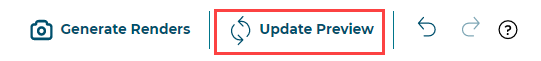
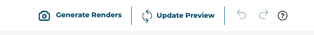
The 3D Product Configurator includes a preview modal of your configurator based on the currently defined data (latest version). To access the preview click the Update Preview button in the taskbar of the configurator builder. This will open a modal screen that will display the configurator currently defined.
Click the X button to close the preview
7. Configuration Preview
The 3D Product Configurator includes a preview modal of your configurator based on the currently defined data (latest version). To access the preview click the Update Preview button in the taskbar of the configurator builder. This will open a modal screen that will display the configurator currently defined. Click the X button to close the preview.
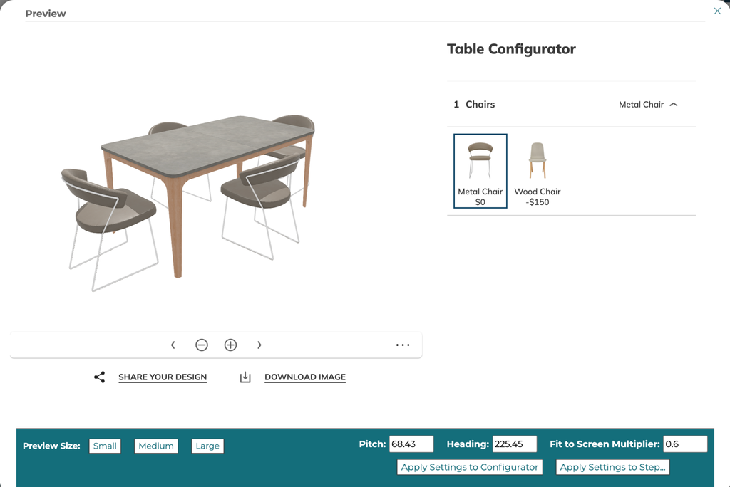
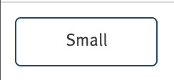
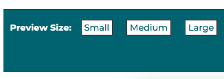
7.1 Setting Preview Size
Choose Small, Medium, or Large to change the preview modal size.
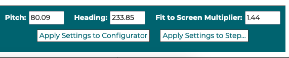
7.2 Applying camera settings as defaults
In the live preview a user can apply the current camera values to the defaults for the configurator or to the currently open step. Once the user clicks one of the buttons the values will be updated in the 3D Product Configurator configuration.
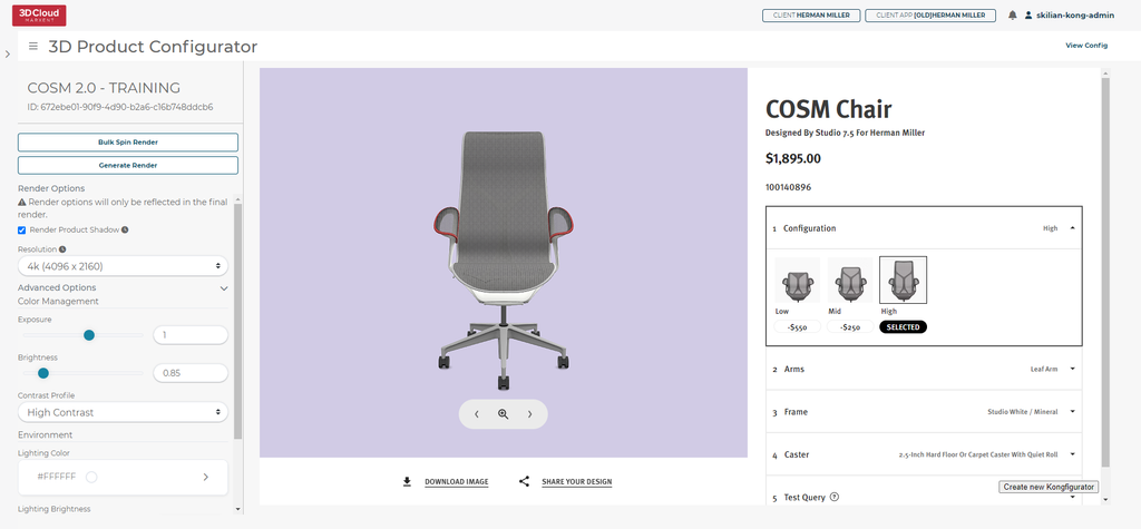
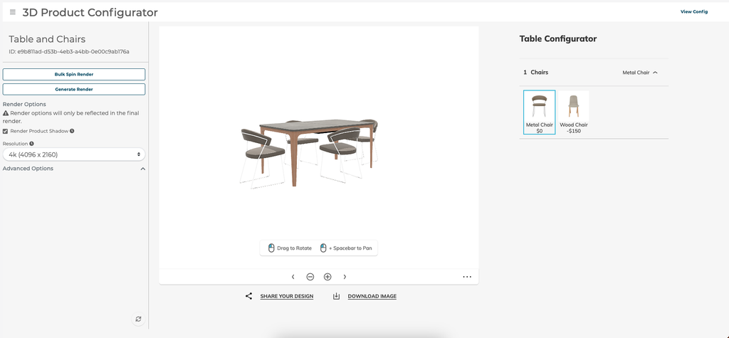
8. Generating Renders
When enabled, the 3D Product Configurator can be used to generate HD renders of the product. To access the HD Render generation, click the Generate Renders button in the taskbar of the configurator builder. Click on View Config to return to the configurator.
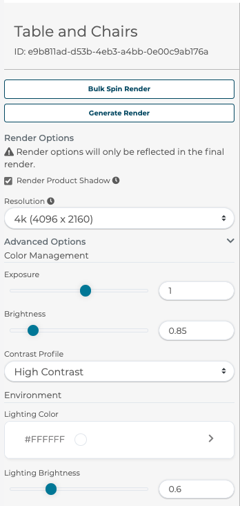
8.1.1 Render Options
A user can apply render options by choosing the Resolution of the render, adjusting exposure and brightness under Color Management, selecting Contrast Profile and lighting brightness under Environment.
Toggle Render Product Shadow to turn off shadows visible at the bottom of the product to better show products like wall art that would not be on a floor.
A user can choose your output resolution from 1k Proof, 2k, and 4k images.
The advanced options are hidden by default and can be accessed by clicking the chevron on the far right. Advanced options give more precise control over image exposure, brightness, and contrast. The scene light color and brightness can also be changed.
Selecting the Bulk Spin Render button will allow for passing in a list of SKUs to render the 33 spin angles in bulk for. The system will check each SKU against what can be generated in this configurator and render images for valid SKUs.
Selecting the Generate Render button will request a single render from the current camera position and angle in the configurator view on the right.
9. 3D Product Configurator Inspection Tool
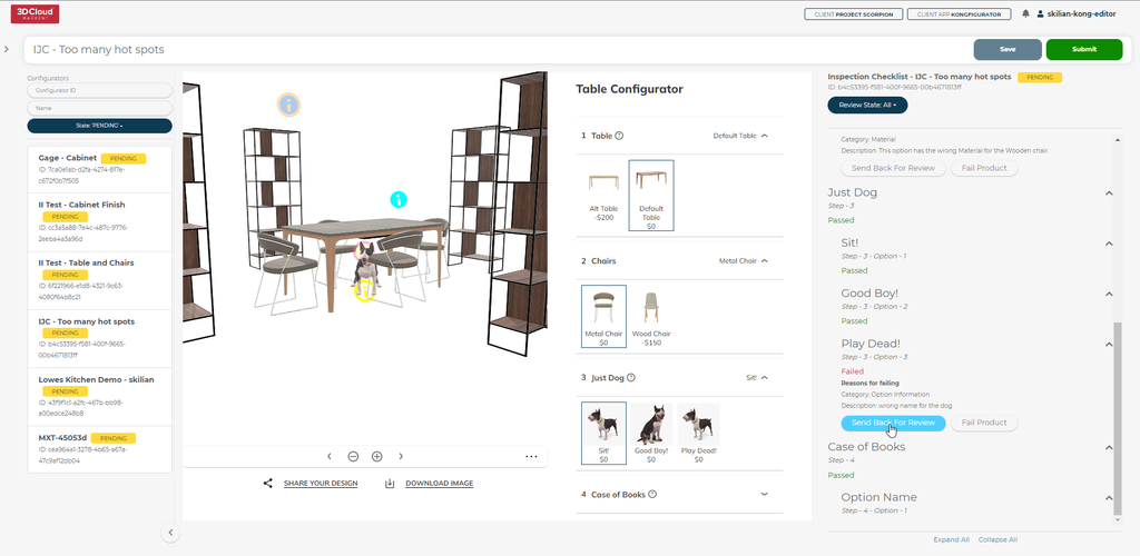
The 3D Product Configurator Inspection Tool is a powerful visual verification tool that provides Quality Assurance Analysts the ability to test a Configurator in a view as close to the live site as possible while passing or failing each Step and Step Option. The assigned Configurator Builder can see the QA states and address each or fail specific geometry and/or materials to the 3D artists. Let’s get started!
9.1 3D Product Configurator Inspection Role
Required to QA configurators in the tool and can be requested from Marxent support/Account teams.
9.2 Publish Configurator to Test/QA
A Configurator will appear in the 3D Product Configurator Inspection Tool in the QA State if the Configurator has been published to the Test environment.
Watch this short 5 minute video for a general overview of the entire process from start to finish or continue reading for more detailed information and screenshots:
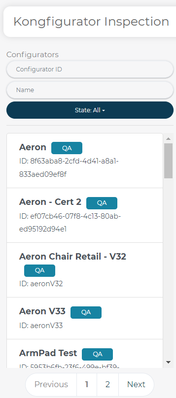
9.3 Where to find the 3D Product Configurator Inspection Tool?
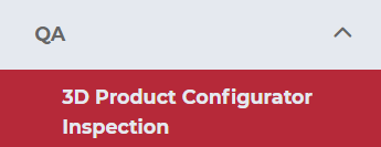
To open the tool go to the QA menu and select the 3D Product Configurator Inspection tool:
This will open the 3D Product Configurator Inspection Tool with no Configurator selected by default:
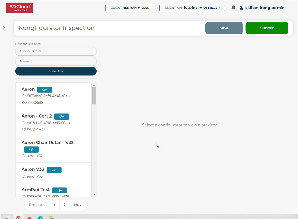
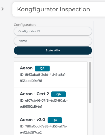
The default list of Configurators promoted to TEST appear as QA state
9.4 Search Filters
Users can search by Configurator ID or Name using the Search Filters above the default list:
Users can drill down to specific states using the State dropdown menu:
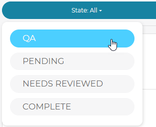
Select from the following States: QA, Pending, Needs Reviewed or Complete.
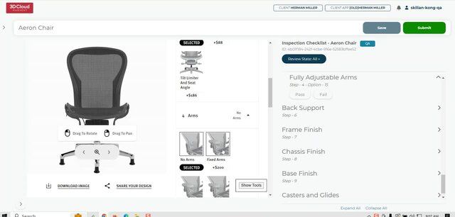
9.5 Pass/Fail Steps & Options (External QA)
Users with the QA Role can open a configurator and review each Step and Step Option, choosing to Pass or Fail items via the menu on the right side of the screen.
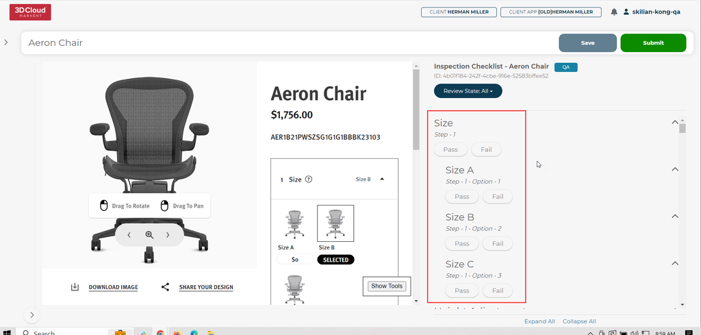
9.6 Filter Pass/Fail Steps & Options
Items can be filtered by status via the drop down menu at the top of the right side menu.
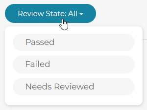
Reviewable States: All, Passed, Failed, Needs Reviewed
9.7 Real-time Step/Option View
Interacting with the configurator on the left will automatically update the items on the right based on the current available steps and options.
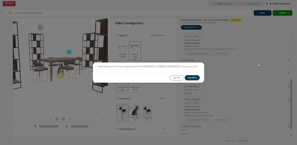
9.8 Save & Submit
Progress can be saved via the Save button in the top right corner:
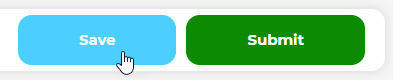
Press the Submit button to move the Configurator from QA to PENDING in the default list.
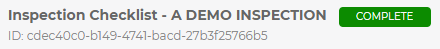
If external QA passes a Configurator, it will be marked as COMPLETE:
If external QA fails a Step/Option, the Configurator will be sent back to the PENDING state upon submission:
9.9 Editor Review
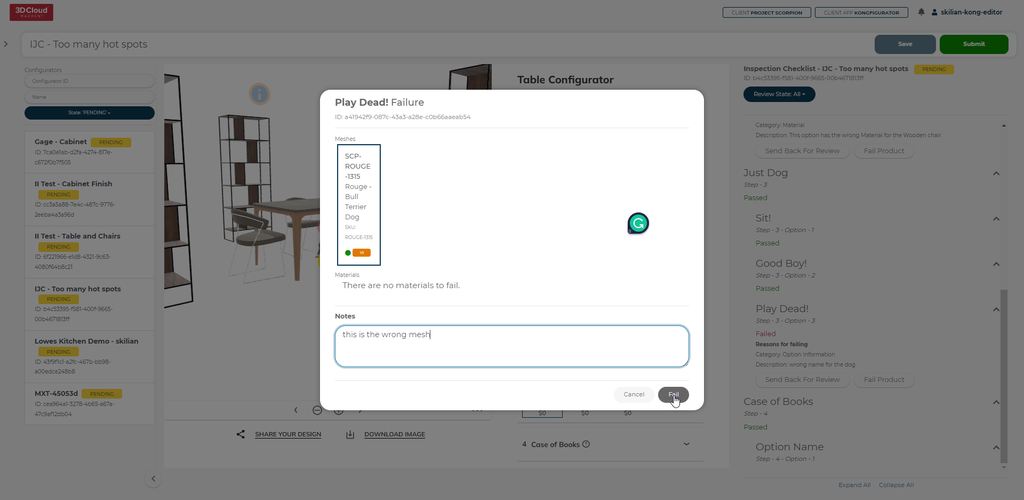
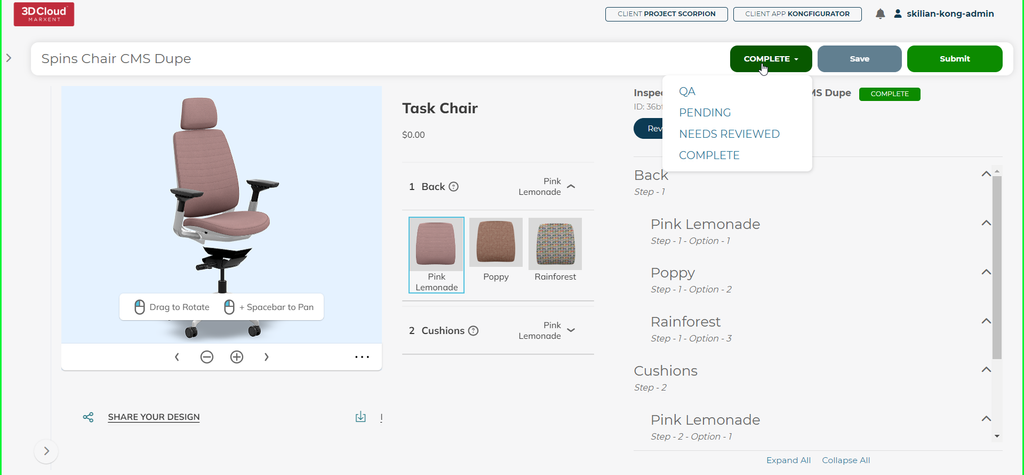
Users with the Editor role can review PENDING items submitted and either fix those items and send them back for review or fail the product back to the artists.
Users can still filter by status using the drop down menu and Save or Submit to the NEEDS REVIEWED State.
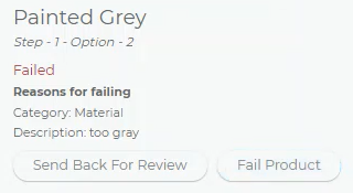
If the user fails the product, a modal will open up allowing for selection of the specific part of the product to be chosen and along with notes failed back to the artist for remediation.
9.10 Manual Reset for Already Passed Configurators (Admin Only)
Even if a Configurator has already passed QA, an Admin has the ability to manually set the Configurator back to any desired state, including QA, PENDING, NEEDS REVIEWED or COMPLETE.
10. Marxent Assembly to Configurator Tool
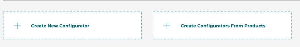
The 3D Cloud™ assembly data structures are used frequently with products in room planners and other 3D Cloud™ applications. To simplify moving those products into configurators the assembly to configurator tool allows for quick conversion of simple 1 level assemblies into configurators. To convert a product with an assembly structure click the Create Configurators from Products button in the file/folder browser of 3D Product Configurator.
Then select a product or products in the modal to automatically create configurators for each product given. This will work for products with one level of children steps like fabric swapping and it works for geoless root products that have 2 levels of products under them. Step options are populated from the compatible MACs and/or the selected product on the assembly steps.
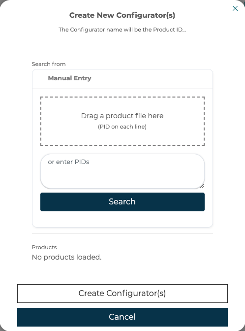
If any errors are detected during creation, the configurator will not be created and a list of errors will be presented to the user. Defaults are set when creating Steps and Options based on assembly defaults, it is up to the user to determine if those defaults are intended or need modification. Layout type, visibility and other similar options will need to be reviewed for accuracy after the configurator is created.
11. Implementing On a Website
The 3D Product Configurator front end code can be implemented on customer facing websites through several methods. Defined below are options an implementing developer can use to integrate with a website.
11.1 Front End Application Supported Browsers and Devices
Chrome | 51+ |
Firefox | 54+ |
Edge | 14+ |
Safari | 10+ (except 15.0; 15.1+ supported) |
Opera | 38+ |
Internet Explorer | Not supported |
Edge iOS | Not supported |
11.2 Front End Application URL Parameters
● ?config=<configId>
○ The Id of the configurator to load, used for debugging purposes a developer should pass in the configurator id in the initialization functions of the API for production use.
● ?storeId=<storeId>
○ Store Id used for Analytics
● ?sku=<sku>
○ Sku of the current chair loaded, auto updated on swapping steps
● ?preview=<true/false>
○ This parameter is for testing purposes only and will force the application to always load the latest version of the configurator.
11.3 Adding the library from the 3D Cloud CDN
Ask your account team for your specific CDN URLs.
JS example:
https://cdn.3dcloud.io/{client_specific_folder}/x.x.x-build.x/MxtProductConfigurator-x.x.x-build.x.js
Minified JS example (should be used in production environments)
https://cdn.3dcloud.io/{client_specific_folder}/x.x.x-build.x/MxtProductConfigurator-x.x.x-build.x.min.js
CSS example:
https://cdn.3dcloud.io/{client_specific_folder}/x.x.x-build.x/MxtProductConfigurator-x.x.x-build.x.css
Initiating the application example:
<!DOCTYPE html>
<html>
<head>
    <title>MxtModularConfigurator Example</title>
    <link href="https://cdn.3dcloud.io/mxt-kongfigurator/8.3.0/MxtProductConfigurator-8.3.0.css" rel="stylesheet">
    <style>
        .mxt-full-modal-screen {
            width: 80%;
            height: 100%;
            position: absolute;
        }
    </style>
</head>
<body>
    <div id="spins-test-container" class="mxt-full-modal-screen"></div>
    <script src="https://cdn.3dcloud.io/mxt-kongfigurator/8.3.0/MxtProductConfigurator-8.3.0.min.js"></script>
    <script>
        async function initializeUnitConfig() {
            const unitConfig = new MxtProductConfigurator.MxtKongfigurator({
                spinCommon: {
                    apiKey: '{user api key provided by Marxent}',
                    element: document.getElementById('spins-test-container'),
                    expandButton: {},
                    webArMode: "OnDemand"
                },
                spin3d:{
                    camera: {},
                    screenshot: {},
                },
                assetEnvironment: '{Active OR Staging}',
                configurationId:  '{configurator ID to load}',
            });
            await unitConfig.init();
        }
        initializeUnitConfig();  // Call the function
    </script>
</body>
</html>
11.3.1 Initialization
When initializing, there are two things that MUST be true about the HTML element that you pass in (or the parent element for the viewer container, see the Components section below)
It MUST have a defined height and width, whether that is an absolute value (like 600px) or a percentage of its parent that has an absolute value (for example 50% of the page width/height). This is because the 3d canvas has no defined size in and of itself, so we have no “size to build out”, so to speak. Additionally, if a size is NOT given, the 3d render engine will spin out of control attempting to render in a 0x0 space.
(for 3d render type only) It MUST be not be
display:nonewhile the engine is running. By default, the engine starts running oninit. IF you want to init the MxtKongfigurator in a hidden container, use the optionspin3d.loadPaused. The 3d renderer will spin out of control when attempting to render to a non-visible container. By using the optionspin3d.loadPaused, the renderer will start in a paused mode. In order to start the rendering engine when the container is made visible, call therun()method. To re-pause the renderer, call thestop()method.
11.4 Minimum Required Options
When constructing the class for the product configurator there are required options and optional options that you will set for the product configurator to function properly. These are the three required options that you must always set.
Option Name | Option Description |
spinCommon.apiKey | API Key provided by 3D Cloud™(required) |
configurationId | the unique id of the configurator to load (required) |
spinCommon.element | The element that the Configurator will be built within. Some sort of specific height and width must be given, otherwise the app will not have any size. This is due to the fact that the rendering canvas has no inherent size. (required) |
11.5 Basic Optional Options
These options are optional and are the most commonly set by developers implementing the product configurator on their website.
11.5.1 SpinCommon options
These options are applicable to the render view for both 2d and 3d renders, and live under spinCommon, i.e.
const configurator = new MxtProductConfigurator.MxtKongfigurator({
    spinCommon: {
        apiKey: '{user api key provided by Marxent}',
        ...
    },
});
apiKey and element are covered above.
Option Name | Option Description |
| CSS string defining color of loading progress bar. |
| CSS string defining color of loading progress bar background. |
| The environment of services to hit. Defaults to production. |
logging | Sets the log level which can be pulled from log.levels namespace; Defaults to WARN |
11.5.1.1 AR Options
Part spinCommon options.
webArMode?: WebArMode;
webArOptions?: MxtSpinsWebArOptions;
WebArMode defaults to WebArMode.None.
WebArMode.Pregeneratedwill attempt to get an AR asset that has already been generated and stored based on the current sku(s). If none exists, then no web AR asset will be available.WebArMode.OnDemandwill look up an existing AR asset based on sku(s), but if one does not exist, a new one will be generated when a user requests one.
webArOptions.enableScaling - by default, scaling on USDZ is turned off. If you wish to enable, set this flag
11.5.1.2 Customizing Text and Icons Options
This only applies to spinCommon options:
To customize icons used in the renderer view:
icons: {
    about?: string;
    close?: string;
    collapse?: string;
    presetView?: string;
    presetViewActive?: string;
    download?: string;
    downloadInverse?: string;
    downloadActive?: string;
    expand?: string;
    rotateLeft?: string;
    rotateRight?: string;
    spinner?: string;
    webAr?: string;
    webArInverse?: string;
    zoomIn?: string;
    zoomOut?: string;
}
To customize text:
customText in the format {[language: string]: any;} where language is a language ISO code (https://www.metamodpro.com/browser-language-codes), for example:
customText : {
    en: {
      about: {
          appName: "My example app name"
      }
    }
};
Rather than providing an exhaustive list of every available key, please contact us with the text you desire to override, and we will provide you with the appropriate key(s).
11.5.2 spin3d Options
These options are applicable to the render view for 3d renders only, and live under spin3d, i.e.
const configurator = new MxtProductConfigurator.MxtKongfigurator({
    spin3d: {
        camera: {}
        ...
    },
});
Option Name | Option Description |
| Use this if you dont want the 3d render loop to start immediately upon initialization. Use especially if you are initializing in a hidden div or one with no size. Call run() method to start the 3d render loop whenever the div becomes visible. |
|
|
|
|
| The amount of screen that a product should “fill” when initially loaded; essentially default zoom level but relative to product size |
| Effectively max zoom, relative to the default zoom level |
|
|
11.5.2.1 Camera Options
Part spin3d options. All nested within a “camera” options object, i.e.
spin3d: {
    camera: {
      allowPanning: true,
      ...
    }
},
Option Name | Option Description |
| If true, right click pans the camera rather than rotates the camera. Panning is limited to bounds of product. |
| |
|
|
|
|
| Minimum camera angle that the camera can rotate horizontally |
| Maximum camera angle that the camera can rotate horizontally |
11.5.2.2 Hotspot Options
Part spin3d options. All nested within a “hotspots” options object, i.e.
spin3d: {
    hotspots: {
      invisibleOnLoad: true,
      ...
    }
},
Option Name | Option Description |
| There is a hotspot toggle in the UI. By default, hotspots show up when there are hotspots and the UI toggle is on. This defaults the UI toggle to off so that the user has to manually toggle the hotspots on. |
| URL base path for a hotspot mesh; we provide a default hotspot mesh, but a custom one can be provided by using this + |
| Filename of hotspot mesh. Must be a GLB/GLTF file. URL is created by doing |
11.5.2.3 Customizing 3D viewer Icon Options
This only applies to spin3d options:
To customize icons used in the 3drenderer view:
icons: {
    hotspotToggle?: string;
    hotspotToggleActive?: string;
    hotspotToggleInverse?: string;
    dimensions?: string;
    dimensionsActive?: string;
    dimensionsInverse?: string;
    panningGuidanceMouse?: string;
    panningGuidanceMousePan?: string;
    panningGuidanceDrag?: string;
    panningGuidanceTwoFingerDrag?: string;
}
11.5.2.4 Dimension Options
Part spin3d options. All nested within a “dimensions” options object, i.e.
spin3d: {
    dimensions: {
      enabled: true
      ...
    }
},
Option Name | Option Description |
| Enable/disable dimensions. Enabled by default |
| Color of dimension lines: |
| Unit type to display for dimensions; defaults to inches. |
| If dimensions should be visible on load. Defaults to off, users must toggle it on |
| Size of line |
| Size of arrows at the end of the line |
11.5.2.5 Preset Views Options
Part spin3d options. All nested within a “presetViews” options object, i.e.
spin3d: {
    presetViews: {
      enabled: true
      ...
    }
},
Option Name | Option Description |
| Enable/disable preset views. Enabled by default |
| We supply default preset views. To override these, provide an array of objects in format: |
11.5.2.6 Screenshot Options
Part spin3d options. All nested within a “screenshot” options object, i.e.
spin3d: {
    screenshot: {
      width: 1024
      ...
    }
},
Option Name | Option Description |
| By default, enabled. |
|
|
|
|
|
|
|
|
| Provide a watermark for your screenshot downloads |
| By default, we provide certain downloads (jpg and png). If you want to provide more/different types, use these plugins to add more. |
| By default, the downloaded image gets a filename of the sku; override this to provide a custom imageFilename |
11.5.3 spin2d options
These options are applicable to the render view for 2d renders only, and live under spin2d, i.e.
const configurator = new MxtProductConfigurator.MxtKongfigurator({
    spin2d: {
        zoomDisabled: true
        ...
    },
});
Option Name | Option Description |
| Use this to disable zoom controls and not allow the user to look at a zoomed in (higher resolution) render |
|
|
11.5.4 Configurator Level Options
These options are applicable to the configurator in general and live at the root level of options
const configurator = new MxtProductConfigurator.MxtKongfigurator({
    assetEnvironment: MxtKongfigAssetEnvironment.STAGING
    ...
});
Option Name | Option Description |
| 2d or 3d. Defaults to 3d. |
| Use PRODUCTION for your production environment and STAGING for your cert environment, and TEST for your test enviroment. LATEST includes works-in-progress configurators and shouldn’t be used generally by clients. |
|
|
| If you want to load a particular sku that is different than the default sku that a configurator model would naturally load |
| Sets the primary color, secondary color, and drop shadow (used on certain buttons). Secondary color is used for the pricing, as well as the gradient color on the main CTA Many more color options can be set via css variables; see custom CSS section. |
| Background color of the renderer only (not of the UI). Use any valid css string |
| Background color to use for screenshots; may be different than the normal background color |
| Ordinarily, for sharing, we share a link that points back to the current HTTP address of the page; override this to point to a custom page. Current URL search params are added to this url. |
heading | Override the default camera heading in degrees, for 3d render type only |
| Override the default camera pitch in degrees, for 3d render type only |
zoom | Override the default zoom, for 3d render type only |
| By default, our UI does not show the step number next to steps; make this true to show step number |
| |
11.6 Advanced Options, Plugins, and Callbacks
11.6.1 Plugins
There are number of different plugins available to override or add to Configurator.
Analytics: spinCommon.analyticsPlugin - Provide a custom analytics plugin; you would probably want to extends Kong3dSpinsAnalyticsPlugin or Kong2dSpinsAnalyticsPlugin depending on if it is a 2d or 3d render type.
All other plugins are passed in via spinCommon.plugins.
Plugins that are NOT provided by default:
KongPluginTypes.BOM- add a plugin that implementsIConfiguratorBomPluginand handles creating a bill of materialsKongPluginTypes.ATC- add a plugin that implementsIConfiguratorAddToCartPluginand handles adding to cartKongPluginTypes.CRM- add a plugin that implementsIConfiguratorCRMPluginand handles doing CRMPLUGIN_TYPE.CONFIG_PRICING- add a plugin that implementsIConfiguratorPricingPluginand handles doing CRM
Plugins that provide a default, but you may want to override:
RendererPluginType.SIF- add a plugin that extendsSIFPluginand provides custom behavior/SIF resolutionKongPluginTypes.HELP_ME_DECIDE- add a plugin that extendsKongHelpMeDecidePluginand provides custom UI for the help me decide modalKongPluginTypes.OPTION_PAGE- add a plugin that extendsOptionPagePluginand provides custom UI for the options UIKongPluginTypes.STEP_PAGE- add a plugin that extendsStepPagePluginand provides custom UI for the steps UIKongPluginTypes.OPTION_POPOVER- add a plugin that extendsOptionPopoverPluginand provides custom UI for the tooltip on options
When creating a plugin, there is an id field that must be provided on the plugin (it is provided on all of our default plugins). If you want the same plugin to be used for every single configurator, use id = DEFAULT_PLUGIN_ID. If you want to use a different plugin for different configurators, then provide plugins with custom id fields, that match the plugin id field on the configurator model.
11.6.2 Custom Error Handling
callbacks?: {
    /** Allow for overriding of the error handling. Return false to prevent our default error handling, return true to continue our normal error handling */
    onError?: (e: PromiseRejectionEvent) => boolean;
};
By default, we handle errors by presenting an error modal to the user. If you want custom behavior, then override this method. To prevent our default modal, make sure you return false from the callback.
11.6.3 Custom Expand/Collapse
spinCommon: {
    expandButton?: {
        onExpand?: () => void;
        onCollapse?: () => void;
    };
},
The picker (if present) will automatically be hidden onExpand and restored onCollapse. However, if you want to take additional action on expand/collapse, hook into these callbacks
11.6.4 Components
Default Layout
By default, the configurator builds out all of the UI in the format below underneath the HTML element provided in the options:
However, we provide the ability for each UI components to be parented independently to best provide the needs for your custom UI. The list of components are:
Component Type | Component Typescript Class | Component CSS Class | Notes |
|---|---|---|---|
|
|
| Contains the UI for picking steps/options, as well as the header/sku/pricing/etc (by default). Basically everything that isn’t the renderer |
|
|
| The container for the renderer. Contains both the renderer itself and the button bar for the renderer. |
|
|
| The scrollable section of the picker; see diagram above, depending on device contains different things. |
|
|
| Container for all modals; by default overlays both the picker container and viewer container |
|
|
| Contains the actual renderer. |
|
|
| Buttons for manipulating renderer (zoom/rotate/etc) |
|
|
| Button to trigger WebAR |
|
|
| Button to trigger About modal |
|
|
| Download screenshot button on button bar |
|
|
| Toggle dimensions button on button bar |
|
|
| Toggle hotspots button on button bar |
|
|
| Show preset view modal button on button bar |
|
|
| Expand/collapse renderer view |
|
|
| Container to show steps; uses |
|
|
| Container to show options; uses |
|
|
| Header label (name of configurator) |
|
|
| Subheader label |
|
|
| Sku label |
|
|
| Pricing label |
|
|
| CTA container |
|
|
| Share button, only shows if enabled for configurator model |
|
|
| Add to cart button, only shows if there is an Add to cart plugin |
|
|
| SIF button, only shows if sif is enabled in app config |
|
|
| CRM button, only shows if there is a crm plugin |
|
|
| BOM button, only shows if there is a bom plugin |
Components Diagram 1
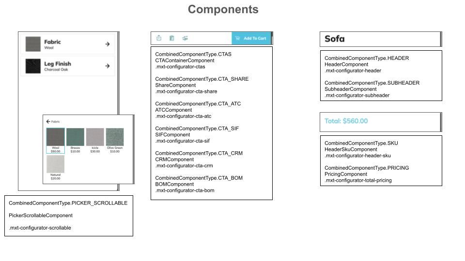
Components Diagram 2
11.6.4.1 Customizing Component Locations
There is an option parentElements. This allows you to provide a different parent element for any given component type. You do not need to provide a parent element for each; you can pick and choose which ones you need to customize. For example, if you have your own section you want to put your CTAs, you could just provide:
parentElements: {
  ctas?: HTMLElement;
}
It is possible to provide custom parents for everything. However, a much more common use case is to just re-parent several smaller components (such as CTA_SHARE or WEB_AR). In that case, use both the spinCommon.element option to set the main parent over everything, and just define the parentElements that would not fall in their default location.
IF YOU DO NOT PROVIDE spinCommon.element (for example if you need to provide different parents for the picker container component and the viewer container component), then we will not create a root element to house everything else. This is a totally valid case, but If a root is not created, we cannot always automatically handle resize events. There are many edge cases where your parent elements may have been configured in a way that a resize event on one effects the size of the other. As a result, we turn off handling landscape vs portrait mode automatically. IF you believe you have a fairly standard setup, you may turn resizing back on via the option autoResizeAllParents.
Component parents may be updated at runtime via
updateParentElement(key: string | SpinsComponentType | KongComponentType, newParent: HTMLElement, removeOldParent?: boolean): void {or
updateParentElements(newParentElements: MxtKongParentComponentOptions, removeOldParents?: boolean): void {11.6.4.2 Disabling Components
Components may be disabled via the option disabledComponents. It is possible to provide non-sensical situations, such as disabling the CTA container but not disabling the CTAs within it. An exception will be thrown in these cases.
In order to disable all picker components (for example if you are building the UI yourself and just using our MxtKongfigurator for the renderer), use the option disableAllPickerComponents.